
Are you looking for ways to convert more of your website visitors? Exit popups are the secret weapon that all smart marketers use to dramatically increase their conversions. In this article, we’ll show you 40 exit popup hacks that will substantially grow your subscribers, and your revenue.
Exit-intent® technology allows you to make one more effort to convert visitors as they are about to leave your site. By detecting when someone is about to navigate away, it presents the visitor with one final message (in a lightbox popup overlay) right at that pivotal moment.
Unlike immediate popups, which interrupt your visitor as they’re trying to browse your site, exit popups aren’t an annoyance.
Now, some people are of the opinion that any form of popup is an annoyance. However, even if your exit popup does annoy the occasional visitor, they were about to head out anyway. There’s no harm in trying to get there attention before they’ve got the door closed.
The truth is, regardless of how you feel about popups, data shows that exit popups actually do work really well. When you implement an exit-intent® popup on your site, you could recover 53% of abandoning visitors like OptinMonster customer Fastrack.
We can’t guarantee that your results will be quite that dramatic, but if you’re not using exit popups, you’re leaving a lot of money on the table.
So, without further ado, whether you’re looking for an idea for your very first exit popup, or looking for new things to tweak and test, here are 40 exit popup hacks to get you started:
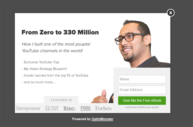
1. Use Your Visitor’s Name
The big reason that so many popups are aggravating to users isn’t that they’re advertisements—it’s because they’re usually far too generic. Personalization can make all the difference, which is why it starts out our list of exit popup hacks.
Imagine moving into a new neighborhood. You head down to the store on the corner and end up chatting with the owner for half an hour about your shared love of breakfast burritos.
As you’re walking by a few days later, one of the street vendors yells out at you, encouraging you to buy an apple from their cart. Then, you hear your name; it’s the shop owner you met the other day, smiling at you and inviting you into their shop.
Are you going to buy an apple from an anonymous vendor or the shop owner calling to you by name and smiling at you warmly?
Yeah, we’d pick the shop owner, too.
Guess what? Your website can do the same thing.
Before you ever ask for a sale, ask your visitor for their name.
Later, when your visitor is about to abandon one of your product pages, you could grab their attention with an exit popup with their own name on it:
You can do this by getting your visitor’s name when they subscribe to your email list, by asking for their name in a previous popup, or by detecting the name of an existing customer.
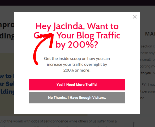
2. Personalize by Referral Source
Continuing in our list of exit popup hacks, in the coveted number 2 spot, is yet another personalization tip. As we just discussed, personalization is key to making advertisements like exit popups feel more friendly.
One super smart and simple way to do that is by personalizing the popup based on the referral source.
For example, let’s say the visitor got to your page through a guest post you wrote for a specific website. Or perhaps you got featured somewhere recently, and you want to get the most out of that traffic by personalizing your exit popups for that particular audience.
You can use referrer detection technology to detect when a visitor is coming from any specific domain, and use that information to customize your exit popups.
Here’s an example from RebootAuthentic:
See how the headline is personalized for Smart Blogger readers? You can personalize your exit popups for any audience you choose.
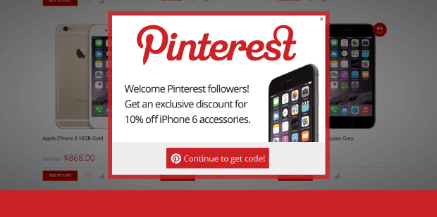
Another possibility is to personalize your popups for traffic coming from your social media channels. For example, if the referring domain is Pinterest, your exit popup could include an offer that appeals to those visitors.
If the referring domain is Facebook, you could invite visitors to join the conversation over on your Facebook page or private Facebook group.
Think like a detective: what information can you deduce about your visitors from the referring domain? How can you use that knowledge to personalize your exit popup?
3. Offer a Content Upgrade
How about presenting your abandoning visitor with an upgrade to the content they were just reading?
By offering content upgrades, RazorSocial increased their conversions by a whopping 520%!
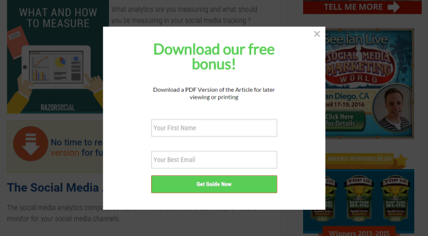
A content upgrade is simply a more in-depth or a higher-value version of a particular blog post. So for example, let’s say your blog post is about how to create an email newsletter. Your visitors might read the post and be very interested in getting started, but think that they don’t have time right now.
As they go to close the browser, present them with a free download of a downloadable PDF version of the post or a checklist with the steps they need to follow.
If you need some help creating your content upgrades, check out these 10 tools to help you create quality content upgrades.
4. Suggest Related Posts
Your website is your online storefront and the longer someone stays in your store, the better. So, sometimes your main objective is simply to reduce your bounce rate and have your visitors spend more time on your site.
A really great way to do that is by using an exit-intent® popup to suggest blog posts that are related to the one they were just reading.
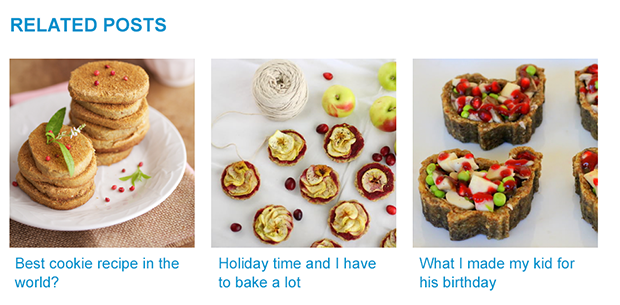
Remember, there are a number of different reasons why someone might be about to click away from your site, and it doesn’t always mean that they aren’t enjoying your content. Perhaps they simply got distracted by something, like a new email or social media notification.
Remind them why they visited your site in the first place: to get specific information from your content.
The key to the related posts technique is making sure that your headlines are highly clickable. Also, use enticing images that draw the eye and relate specifically to the post topic. If your related posts are appealing, you’re more likely to re-engage distracted visitors and persuade them to stick around for a while longer.
5. Give Visitors a Few Choices
The problem with so many exit popups is that they don’t offer something the visitor really wants. This happens because many businesses have several different buyer personas, and each persona is going to respond to offers differently.
Sure, your popup might be offering the greatest ebook known to man about how to juggle 6 balls in the air, but if a segment of your visitors has already mastered that technique, and now wants to learn how to spin a ball on their nose, then your offer is useless for capturing those visitors.
A simple way to get around this problem and present the perfect offer to each visitor is by letting them choose what they’re most interested in.
You can do it like this: first, present an exit-popup with 2-3 options for them to choose from.
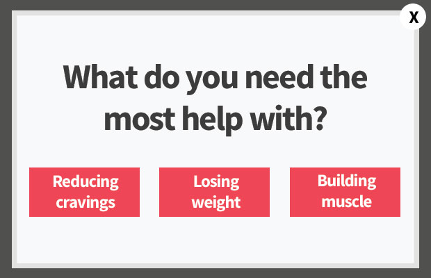
Once they select an option, present them with the optin form to get a lead magnet specifically tailored to the topic they chose.
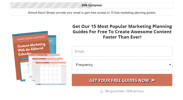
6. Add a Progress Bar
There is a psychological phenomenon that makes people feel uncomfortable leaving things incomplete. It’s known as the Zeigarnik Effect, a term coined by the 20th-century Russian psychologist, Bluma Zeigarnik.
Zeigarnik saw that waiters could remember long food orders and match the correct meal to each customer but they promptly forgot these orders as soon as the food was delivered. She wondered why, so she conducted a series of experiments to figure it out.
Her theory was that the pending order created a state of “incompleteness” in the waiter’s mind, which made them unable to let go of the information until that state of mind was resolved through delivery of the meal.
Through her experiments, Zeigarnik discovered that unfinished tasks are remembered about twice as well as completed ones and that we as humans have a child-like impatience to gratify this need for closure.
You can take advantage of the Zeigarnik Effect to coax your visitors into action by showing them that they have an incomplete task. By pointing out the “incompleteness,” they’ll seek to get closure by completing the task.
LinkedIn does this by showing you your progress as you fill out your profile. By showing you your “profile completeness,” you get the urge to enter all the information that they want until your profile appears as “100% complete.”
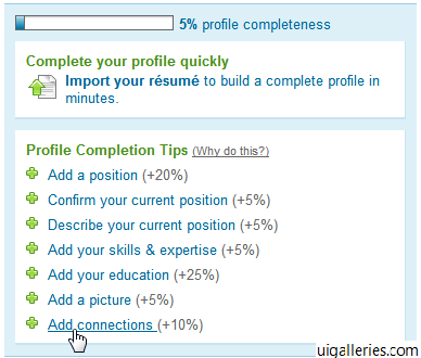
This can work for exit popups as well. All you have to do is display a progress bar at the top. Here’s an example from CoSchedule:
7. Include a Picture of the Bribe
Images can make a huge difference in any online marketing campaign, and exit popups are no exception.
In eCommerce, 67% of consumers say that the quality of the product image is “very important” in selecting and purchasing the product—more important than product-specific information, a long description, or even ratings and reviews!

Images are so important to shoppers when deciding whether to purchase a product, so think about how you could use images to get people to do something smaller, like entering their email address for your free ebook.
Matthew Barby includes an appealing mockup of his Growth Hacking eBook in his popup:
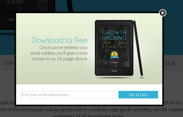
Since he’s using an image of the product, which includes its title, he doesn’t even need that much copy to get the point across. The only description he really includes (or needs) is that the book you’ll get is 54 pages long.
If Barby removed the image, it might be a whole lot less appealing, right?
8. Overcome Objections
This is one of the best exit popup hacks for eCommerce product pages and checkout pages.
What if your potential customer is on the fence about purchasing your product because of just one small objection, and if you could overcome that objection it would be the last nudge they need to make the purchase?
One of the biggest objections that shoppers have is the worry that they will buy your product and later regret it. The dreaded Buyer’s Remorse.
Thankfully, this is also one of the easiest objections to overcome when you provide some sort of money back guarantee.
Neil Patel overcomes this objection by including a 30-day money back guarantee on his exit popup for Quick Sprout.
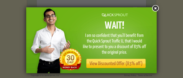
But don’t stop at a money back guarantee. Take inventory of all the likely objections that your shoppers may have, and check that you’ve thoroughly covered them all, either on your product or checkout page or on your exit popup.
Here are the 10 most common objections that online shoppers have, and ideas for how you can overcome those objections in your exit popup:
- I need to think about it. People make purchases based on emotion, so if you appeal to them on an emotional level, you’ll likely overcome this objection.
- I need to talk to my wife/husband/partner. Give them a reason why their significant other will be grateful that they got this product.
- I can find it cheaper somewhere else. Demonstrate that you’re the best value or the best price around.
- I’m happy with what I already have. Show them how their life will be better with your product.
- I don’t have the budget. Offer a payment plan. Or, calculate how your product will actually save them money, or make them money in the long run.
- I’m not sure if it will work for me. Offer a trial.
- How do I know my credit card information will be safe? Display a security badge.
- I don’t have time right now. Throw in a limited-time bonus.
- Why should I choose you instead of the other guy? Show what makes you better than your competitors.
- I’m not sure it has all the features I need. Highlight your most amazing features in a bulleted list.
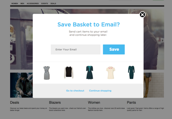
9. Give a Reminder
When a shopper is about to abandon their cart, do you use an exit-intent® popup to recover them?
Exit popup hacks #6 and #9 both use the Zeigarnik effect to prevent shopping cart abandonment.
Simply remind them that they still have items left in their cart, and it will create a strong—sometimes irresistible—urge to get closure by completing the purchase.
Your copy could say something along the lines of, “Wait! You still have these items in your cart…” or “Wait! Don’t leave without your…” and then show images of the items they are about to leave behind.
Sometimes, however, shoppers just aren’t ready to buy, even though they’re still interested. Offer to save their basket, and collect their email in the process. Then it will be super easy for them to come back to your site and pick up where they left off, and you can even start sending them emails. Check out our list of abandoned cart email examples for inspiration.
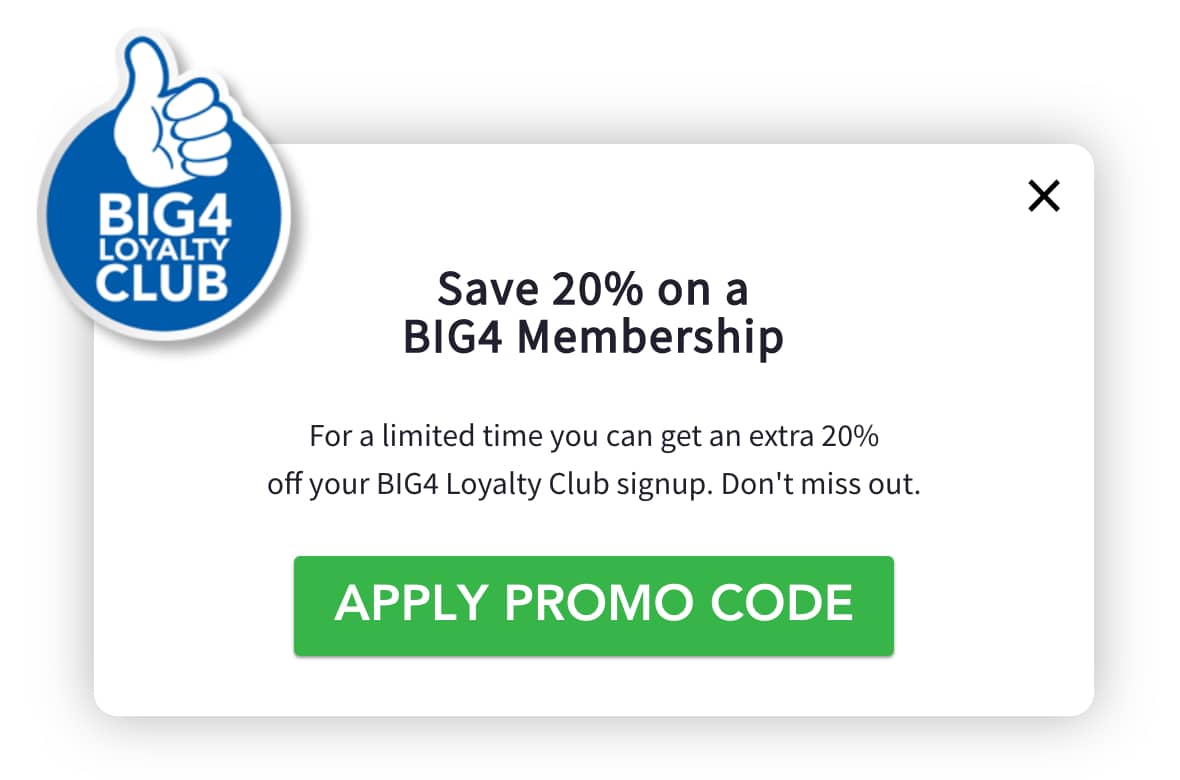
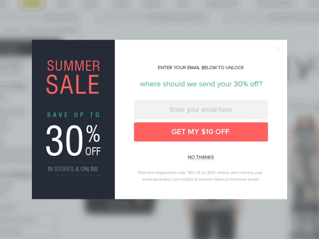
10. Offer a Discount
The great thing about offering a discount in an exit popup, in exchange for the visitor’s email address, is that it accomplishes two things at once:
- Offering a discount encourages shoppers to go through with a purchase they were on the fence about.
- Even if they don’t buy today, offering a coupon rarely fails to at least collect their email address, so you can market to them in the future.
Here’s an example:
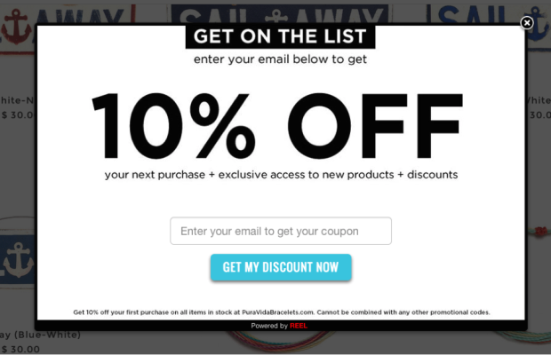
What’s really great about this example is that they also point out that getting on the email list gives you exclusive access to new products and discounts—even more reason to opt in! And instead of a generic “Subscribe” button, they’ve used much more compelling copy, “Get My Discount Now.”
If you are looking for a surefire way to recover visitors who are about to abandon your eCommerce site, coupon exit popups are the way to do it. After all, if someone is interested in buying your products, why wouldn’t they accept an easy discount?
Pro Tip: Make sure to include any fine print about the offer somewhere at the bottom of your exit popup.
11. Offer Free Shipping
Did you know that shipping costs are the #1 reason for shopping cart abandonment? Offer free shipping in your exit popup, and you stand to recover 44% of shoppers about to abandon their carts.
So, free shipping exit popups are a no-brainer. However, there are two different ways you can approach them.
The first way is to give the free shipping coupon code right inside the exit popup, as shown below:
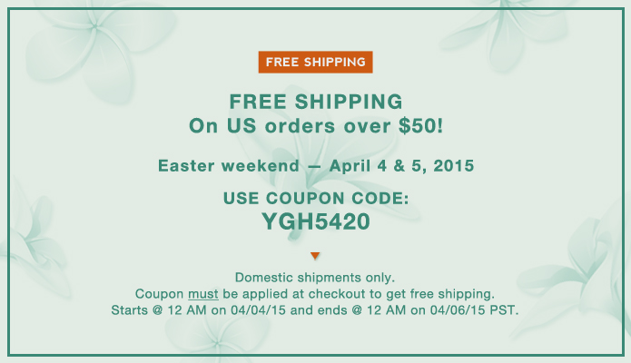
To make the purchase easier, you might even include a link back to the product they were viewing, or a link back to the shopping cart, similar to what Baby Age does below with their “Apply Coupon Instantly” button.
The advantage of this method is that there’s no additional work needed on the shopper’s part to complete their purchase. If they were already thinking about buying, but shipping was an issue, all they need to do is copy and paste the coupon code and checkout.
The only disadvantage to this method is if they don’t buy now, you’ll have missed out on collecting their email address.
We suggest giving the free shipping code directly on your shopping cart pages to prevent shopping cart abandonment. On product pages, you might try offering the free shipping in exchange for an email address.
As with anything, you’ll need to test it out to see what creates the best results for you.
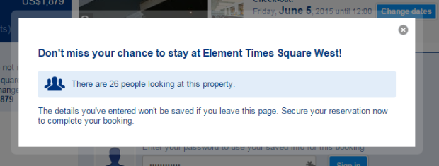
12. Create Scarcity
It’s a well-known fact that scarcity (having less of something) increases the urge to buy. Nobody wants to miss out on getting something they want, and it doesn’t feel good when someone else gets it and you don’t.
Zulily does an amazing job of creating scarcity. When you add an item to your cart, they include the number of items left (e.g. “HURRY—only 6 left!”) in big red letters on the shopping cart page.
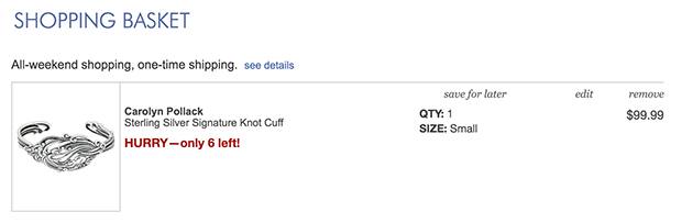
Now imagine how effective this could be as an exit popup that appears when someone is about to abandon their cart.
Booking.com uses a popup during the reservation process to show how many other people are looking at the same hotel. Better act now before someone else gets your room!
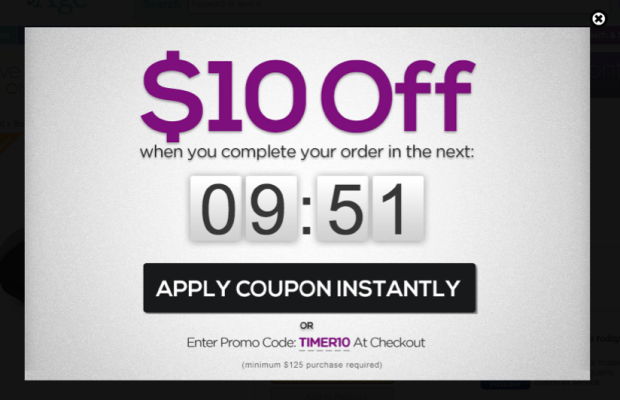
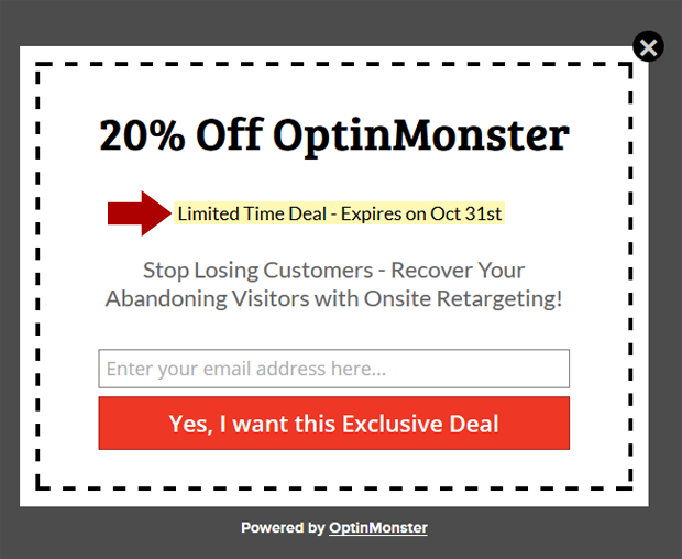
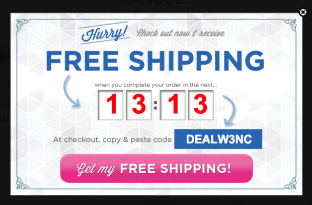
13. Add Urgency
It’s human nature to procrastinate. Whether it’s deciding to enter an email address or make a large purchase, people tend to avoid making difficult decisions.
Urgency gets the ball rolling by defining a definite deadline, either you get the offer before this time, or you miss out.
OptinMonster’s exit popup highlights the limited time discount with yellow and a red arrow so you are sure to notice it.
Diamond Candles uses a countdown timer to just a few minutes, so you have to check out right now or you’ll miss out on the free shipping.
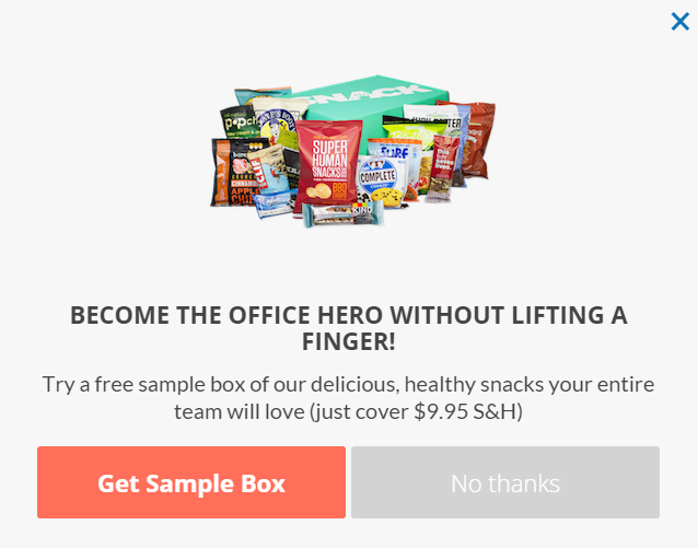
14. Offer a Free Trial
It takes approximately 7 touches to make a sale, so offering a free trial gives you a great chance to get your foot in the door and warm up your leads with multiple touches.
Snack Nation understands this well. All you have to do to get a free sample box delivered to you is cover the $9.95 shipping and handling.
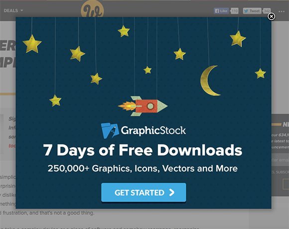
Web Designer Depot offers 7 days of free downloads. What’s great about this popup is they bring to your attention how valuable these 7 days are, with over 250,000 graphics, icons, vectors and more.
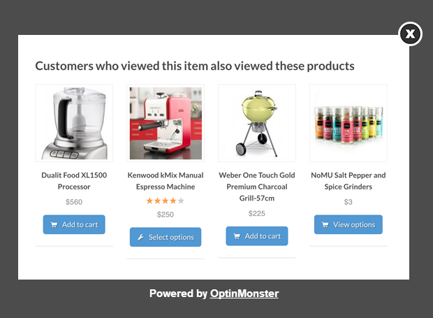
15. Suggest Related Products
Similar to suggesting related posts in an exit popup on a blog post page (as in exit popup hack #4), you can also suggest related products on product pages.
If you have a wide range of products (like clothing or shoes), it’s extremely helpful to recommend other similar products related to the one that the shopper is viewing. The product that they’re looking at might not be the right fit, but a similar product might be just what they need.
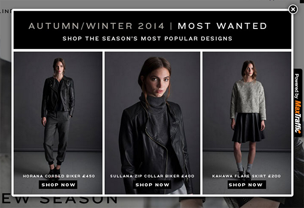
16. Suggest Popular Products
Throw some social proof into the mix and suggest your most popular items in an exit popup.
Not only does this help keep shoppers on your eCommerce site for longer, but it reminds them that other shoppers love your products too!
Muubbaa uses the headline, “Most Wanted” to reinforce the desirability of their clothing.
17. Offer More Value
Some customers might be leaving because the product you offered wasn’t quite robust enough for them. If you think that might be the case, offer them an upgraded version of your product (known as an upsell).
To learn more, read What Is the Difference Between Upselling and Cross-Selling?
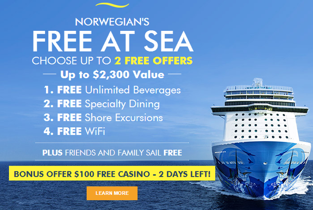
Norwegian Cruise Line adds value by offering additional amenities to your reservation, free of charge.
Don’t hold anything back that you can offer or give away as a bonus. Your exit popup is your last chance to capture those leads, so make it good!
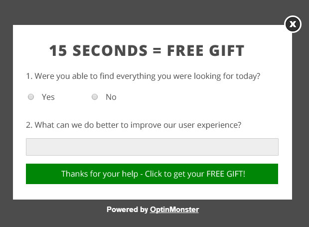
18. Present a Survey
Surveys are a great way to learn more about your visitors and how you can make your website better. However, many sites use them at the wrong times, which makes for terrible user experience.
Imagine landing on a website for the first time and then being hit with a survey about how your experience has been on the website. Or being right in the middle of a purchase, and getting interrupted by a popup survey. That would be pretty annoying, right?
The good thing about exit popups is that they don’t interrupt you in the middle of doing something on the page. This makes exit popups great for surveys. Just make sure that you don’t include a survey on your homepage, or on any other page that wouldn’t make sense for someone to be filling out your survey.
Also, be respectful of your visitor’s time and don’t expect them to fill out a survey for nothing. Give them something in exchange. Here’s an example of a quick 15-second survey with a free gift:
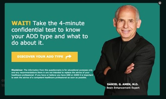
19. Give a Quiz
Quizzes are one of the most irresistible lead magnets because they provide personalized information based on how the user responds. Personality type quizzes are especially popular.
Why? Robert Simmermon, Ph.D., a media psychologist, says, “I think [online quizzes] are fun, but I think it also does touch something about our own sense of our unfolding story.”
Quizzes satisfy our natural desire to make sense of our lives by organizing events into stories to create our own biographies (according to narrative psychology). They also offer the opportunity to reaffirm judgments we’ve already made about ourselves, and let us be the heroes of our own story.
VisualDNA uses quizzes to gather insights into audiences. People voluntarily take their quizzes to uncover who they are on the basis of psychological theory, and they get to amass an enormous amount of audience data. It’s brilliant!

But quizzes aren’t just limited to personality types. You can use quizzes to re-engage your abandoning visitors on just about any topic.
Here’s an example of an exit popup quiz from Healing ADD on finding your ADD type:
20. Offer a Done-for-You
Sometimes your visitor is enjoying your content, but they’re too busy to implement your advice on their own. Solve that problem for your visitors by offering a done-for-you solution.
For example, Betty Means Business offers 3 essential done-for-you scripts to attract more clients.
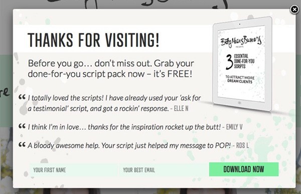
You could offer something similar with a fill-in-the-blank PDF template, an Excel spreadsheet, a Photoshop file, a Word Document, or even audio clips.
On product pages, you could implement an exit popup with an offer to configure the product for the customer. Or, if the product requires any work on the customer’s part, offer a complete done-for-you service.
Put yourself in your visitor’s shoes and think, “What can I do to make their life easier?” If you can save them from a lot of time or frustration, you’ll have the perfect hook for your exit popup.
21. Use the Word, “Wait”
Stop your visitors in their tracks with the powerful word, “wait.”
Perhaps it’s due to our need for closure, but there’s something alluring about the word “wait,” isn’t there? What are you waiting for? So mysterious!
Green Mountain Mustard knows you were thinking about buying mustard since you were browsing their site, so their exit popup gives you a friendly reminder.
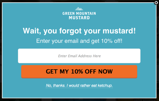
You could do the same thing on a landing page or a product page. Remind visitors of what they’ll miss out on if they click away now.
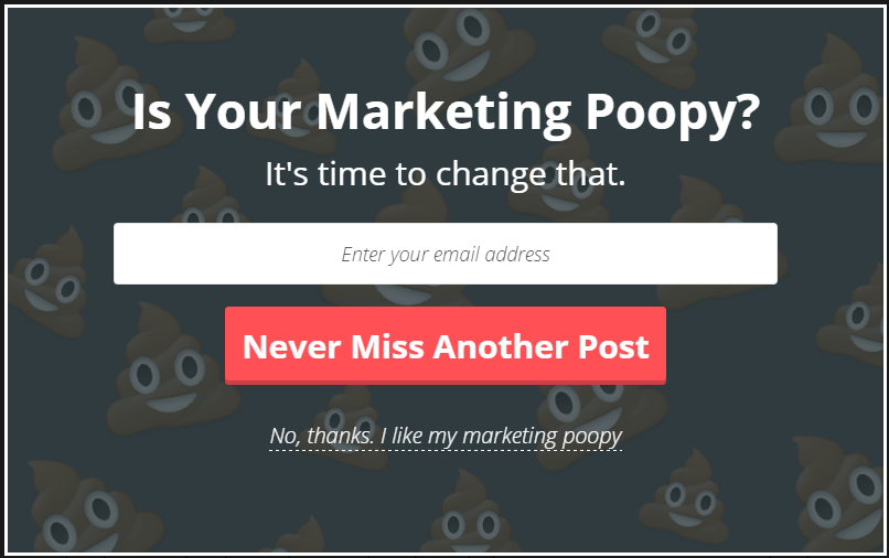
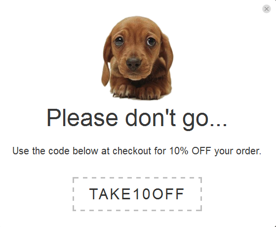
22. Make Them Laugh
Another reason visitors bail on your site is that they’re simply bored. But if you can make them smile or even laugh, it will be hard for them not to take you up on your parting offer.
KlientBoost uses the “pile of poo” emoji—those cute, smiling piles of poop—to lighten the mood.
Here’s another example of a humorous exit popup. How can you resist those big, brown puppy eyes?
GQ Magazine gets real in-your-face with this humorous exit popup:
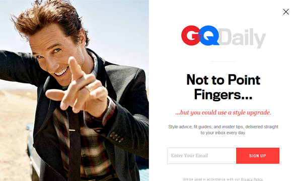
If humor fits with your brand, this is not the time to hold it in, so let it loose in your exit popup!
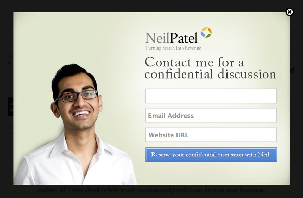
23. Offer to Chat
You’ve probably been on a sales page before where you saw a chat box pop up, like this one from Xchop:
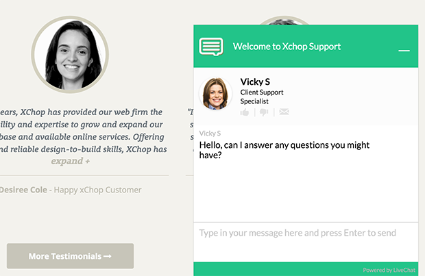
This, of course, lets you give your potential customers answers to any questions they may have about purchasing your product or service.
However, you don’t have to offer 24-hour live chat in order to be helpful to your visitors.
Use your exit-intent® popup to schedule a time to chat at a later date. Neil Patel asks for the visitor’s name, email and website URL to reserve a confidential discussion:
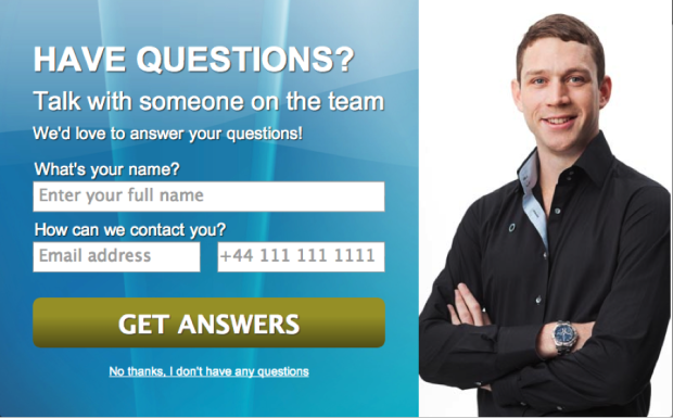
And here’s another example where the popup asks for the best contact information, giving the choice of either email or phone:
24. Use a 2-Step Optin
Psychologists have discovered that we all have a strong urge to be consistent. Once we make a decision or perform an action, we have the tendency to stick by that decision in all our future actions. This is known as a “decision heuristic:” a mental shortcut for making decisions.
Asking your visitors to take the first step is always the hardest. But if they just take that one step, all the next steps will become much easier. That’s because they are building up mental momentum.
Making that first step really easy for prospects to take gets the ball rolling. Then, you can get them to take a more difficult action. Kind of like a domino effect, you have to apply a bit of force to knock down the first domino but after that, all the other dominos fall down effortlessly.
Smart marketers understand this principle and put it to use in their optin forms by asking for an easy action first (press a button) before asking for a more difficult action (submitting their email address). This is called a 2-step opt-in.
How can you use a 2-step opt-in with your exit popups? Simple. Place a button on the exit popup that users will have to click before they can see the opt-in form. Use a call-to-action that would be a no-brainer for your target subscriber or something they simply can’t resist.
For example, QuickSprout once used the headline, “Are You Doing Your SEO Wrong?” If this headline had been on a 2-step exit popup, they could have had a button below it saying, “Click Here to Find Out.” Then after the click, they could have displayed the opt-in form.
Treehouse uses the headline, “Change your Career. Change your Life.” If they put that headline on a 2-step exit popup, they could display a button below it saying, “Claim Your Free Trial.” Then, they reveal the form to enter your name and email.
See how that works? A simple button looks a lot more harmless than a form asking for information. Visitors won’t see the harm in taking that first action, but then they’ll feel committed to following through.
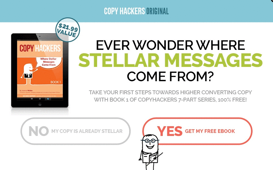
25. Give a Yes/No Choice
Another version of the 2-step opt-in is a yes/no choice. But instead of just one call to action button, you offer two: a “right” choice and a “wrong” choice.
Here’s an example from Social Triggers:
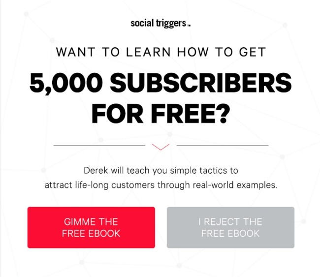
This works to increase conversions because of the psychology of choice: when given a choice of doing something, people are more likely to want to do that very thing.
Choices make us feel more in control, more powerful. When we feel powerful, we tend to act more impulsively when it comes to making decisions.
For this to work for your exit popup, you need to make the “right” choice really obvious to the visitor. So obvious, in fact, that they don’t even have to think. Remember, the minute they have to think about the choice, you’ve lost them.
The color of your call to action buttons is important for this type of exit popup. We’ve been conditioned to associate bold colors with action, and dull colors with inaction. By making one button pop with a bright red color, and making the other button grayed out, the visitor gets the psychological message that they’re supposed to click on the red button and not the gray one.
Be sure to use your powers for good and not evil. ?
Your button copy is important too. You want your users to feel that they actually have a choice while still making it a no-brainer decision. This is something of an art, and many marketers tend to go over the line by writing copy that sounds too pushy or condescending.
The Social Triggers example above is a great example because the negative option uses the word, “reject.” This is an excellent word to use because it’s empowering. Being able to reject something gives me that feeling of being in control of the situation.
At the same time, why would I want to reject something that’s being offered for free, especially if it delivers on the big promise in the headline (“Want to learn how to get 5,000 subscribers for free?”). Plus, it sounds a little silly and over-the-top.
Naturally, I’m going to go with the free ebook.
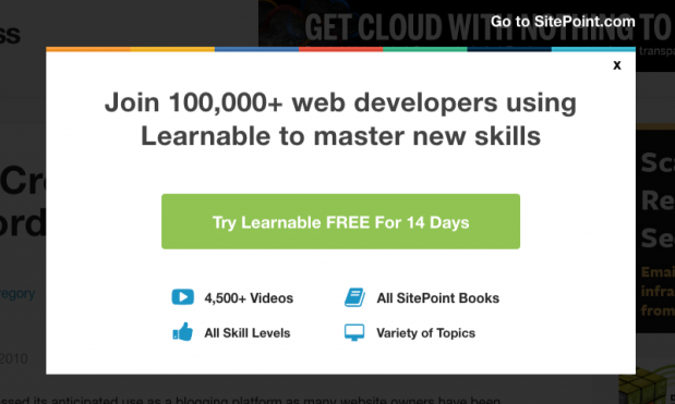
26. Use Social Proof
Social proof works because we tend to look to others in order to decide the right thing to do.
Over 100,000 web developers can’t be wrong, right?
Or how about 310,000+ dog lovers? In fact, if you’re a dog lover you might be asking yourself, “Why didn’t I join this community sooner? If so many others have joined, they must know something I don’t.”
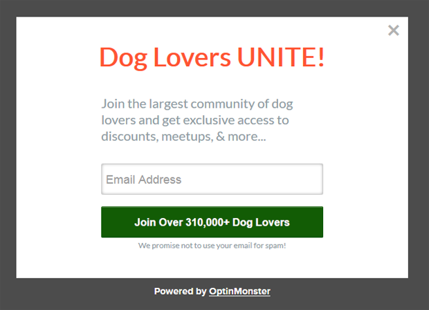
These are some pretty impressive examples, but you don’t necessarily need huge numbers in order to leverage social proof in your marketing. In fact, you don’t need your own numbers at all. You could simply use someone else’s numbers or results as an example. Simply point out what others have done, and how your prospect can follow their lead.
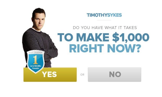
27. Use Your Credentials
Authority is a powerful tool that you can use to increase conversions on your exit popups.
If you have any special certifications or qualifications that can give visitors greater confidence in your authority and expertise? Show that off on your exit popup!
Timothy Sykes displays his “Top Trader” badge right on his exit popup:
Have you written any guest posts for popular blogs? Have you been featured in any magazines? Display all of those logos at the bottom of your popup as PreneurCast does:
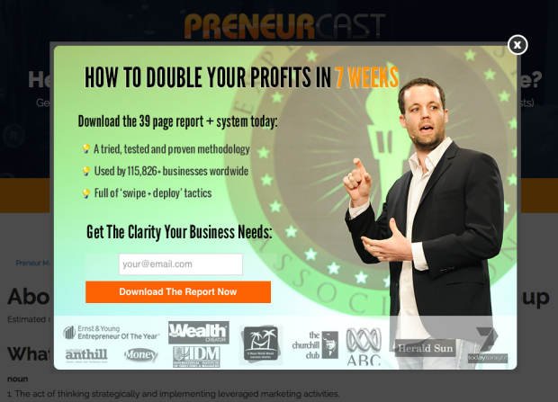
Remember, people have a natural tendency to follow authority figures. Position yourself as the expert, and it will be so much easier to get visitors to take the action you’re asking of them.
28. Use Numbers
Numbers can be used in a variety of ways to increase conversions on your exit popups.
For starters, numbers are great attention-grabbers. There’s just something about seeing a number—especially a very specific, odd number, like 1,837—that causes us to stop and take notice.
We also know that people have a tendency to infer larger sizes, or more of something, from larger numbers. So 660 minutes sounds larger than 11 hours, even though they’re the exact same amount of time. Use this to your advantage in your popup copy by using smaller units when you want to give the impression of bigger amounts.
Of course, if you have big amounts to show off, like Syed Balkhi, then by all means, do it!
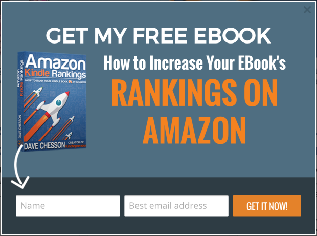
29. Use Arrows
Just like great copy, great popup design can increase conversions on your exit popups by drawing the eye where it needs to go.
Our eyes have the ability to take in so much visual information that it’s more than our brains can consciously process. So, we’re hardwired to focus on only the most compelling information—the information we believe to be the most important—and skim over the rest.
This is called selective attention. The result of selective attention is that people naturally look for visual information to tell them what’s important and what’s not. Because of this, we can actually direct where the eye will look by guiding their eye using visual cues, like arrows.
Arrows actually help the viewer comprehend information better than written directions alone. They literally point the way, direct the viewer’s focus, and help the viewer filter out unimportant information. Use arrows on your exit popups to direct attention towards your call to action.
Here’s an example from Kindlepreneur:
30. Use Animation
Another way to guide the eye towards your call to action is with movement.
An animation, like the one below, is nearly impossible for the eye not to follow. In fact, this particular animation points at the call to action button, combining a directional visual cue with movement. The result is an extremely powerful exit popup.
Hard to look away, isn’t it?
31. Ask Visitors to Follow You on Social
Asking for an email address can be tough; due to information overload, people can be fiercely protective of their email addresses these days.
To ask them to follow you on social media, however, is a bit easier. Especially if your social media channels have a significant following (social proof), it should be relatively simple to get an abandoning visitor to click the “Like” or “Follow” button.
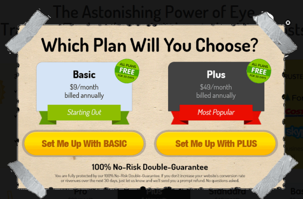
32. Assume the Close
A particularly gutsy move is to stop asking whether a visitor wants to take action, and just assume that they do.
On his webinar registration page, Neil Patel’s exit popup is a simple registration form.
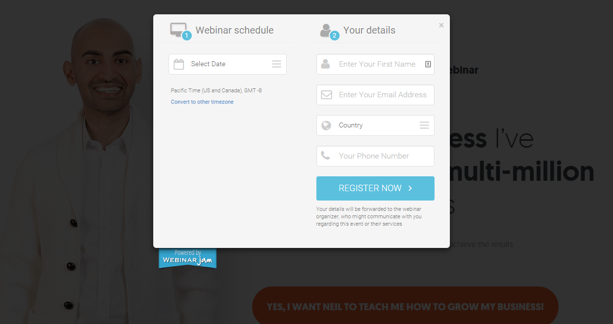
Notice he doesn’t try to sell you on the webinar at all. There’s no headline or any details about what the webinar is about. He simply assumes that you want to register.
CrazyEgg assumes that you want to buy one of their plans. Rather than trying to sell you on their plans, they simply ask, which one will you choose?
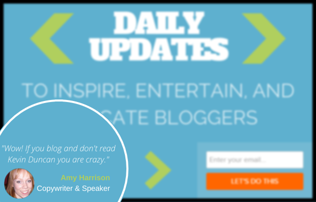
33. Include Testimonials
We all know how important testimonials are on sales pages, but what about exit popups? The fact is, your exit popup is a mini sales page. You may be giving something away for free, but you’re still asking for something in return, whether that’s an email address or a small action, like following you on Twitter.
Convince visitors to take action by using recommendations from your customers and subscribers. If you can include a photo of their faces, all the better.
Kevin Duncan of Be a Better Blogger uses a subscriber testimonial on his exit popup to drive home the value of becoming a regular reader and subscribing for updates.
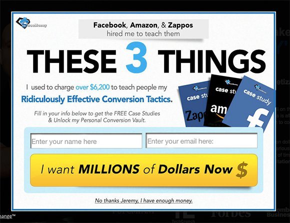
34. Use Compelling Button Copy
Is your call to action button copy generic, like “Subscribe,” “Download,” or “Sign Up?” ?
Sorry, what? Dozed off a bit.
If you want your button to be clickable and compelling, kiss the generic copy buh-bye.
Instead, use copy that focuses on the benefits visitors will get from your offer.
For instance, Shoe Money offers free case studies as their lead magnet. Instead of a generic, “Download Now” button, their button copy reads, “I Want Millions of Dollars Now.” How’s that for compelling?
You can also make your button copy more enticing simply by being more specific about what they’re getting, or the action they’re taking.
If you are giving away a coupon, use a specific dollar amount right on the button: “Get My $10 Off.”
To give you some inspiration, here are even more great examples of call to action button copy:
- “Start writing” – Medium
- “Give Basecamp a try – it’s free for 60 days” – Basecamp
- “Find your gym & get membership” – Anonymous case study
- “Show Me My Heatmap” – CrazyEgg
- “Build a Manpack” – Manpacks
- “Send a GiftRocket” – GiftRocket
- “Talk to us” – Contently
- “Let’s Do It!” – Less Accounting
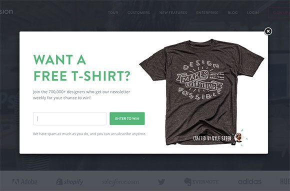
35. Give Visitors a Chance to Win
Sometimes visitors need a little extra incentive to take action. Free digital downloads are increasingly common, but physical items tend to have a higher perceived value. So, why not give away something physical?
You don’t need to give everyone a physical gift. Just give them a chance to win the gift when they sign up for your newsletter.
For example, Invision gives you an entry into their free t-shirt drawing when you sign up with your email address.
Yorkdale offers an entry into their monthly drawing for a $150 Yorkdale gift card.
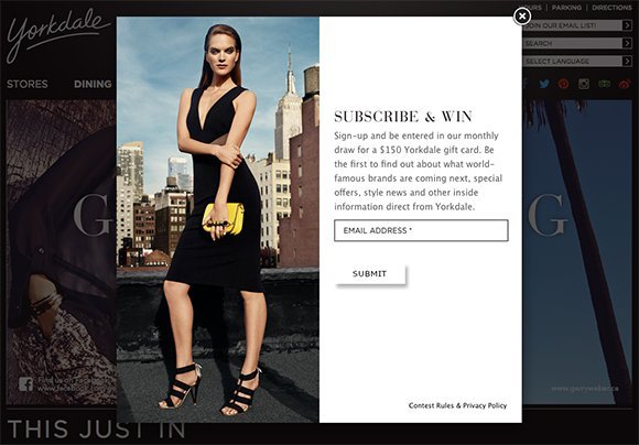
You could also offer additional entries for other actions, like sharing on social media or referring a friend via email. Giveaways are a powerful means of driving traffic to your website, so put them to good use in your exit popup.
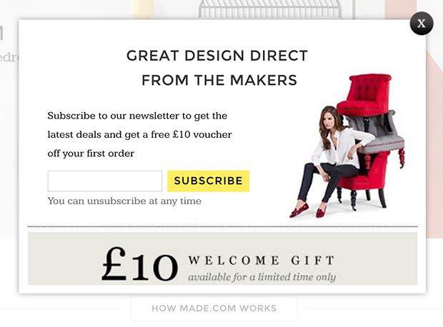
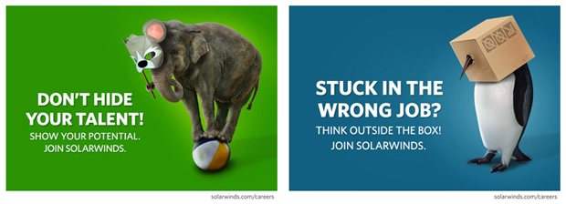
36. Use a Striking Image
Sometimes all you need to grab your visitor’s attention is a striking image.
For example, Made uses this unusual image of a model with chairs stacked on top of each other to grab your attention:
FedEx uses a map of the globe to illustrate their point in a fun, unexpected way:

SolarWinds uses animals and a dash of humor to spice up their ad campaigns:
Even something as boring as a Band-Aid can be made interesting with an eye-catching image:

Use a dramatic or unexpected image in your exit popup and you’ll stop your visitors right in their tracks.
37. Use Color to Direct the Eye
Remember how we mentioned that our eyes can take in way more information than our brains can actually process? Because of that, people look for visual cues to tell them what’s important and what they can ignore.
Color is one of those important visual clues. The specific color you use is less important, but how you utilize contrast in color is essential to directing the eye where you want it to go.
Studies show that the eye naturally skims a website from top to bottom, making forays into the middle from left to right, forming an “F” shape.
Once you understand this, you can place important elements along that natural F-shaped path, and use color to place greater visual weight on some of those elements.
Take a look at this exit popup from Marie Forleo:
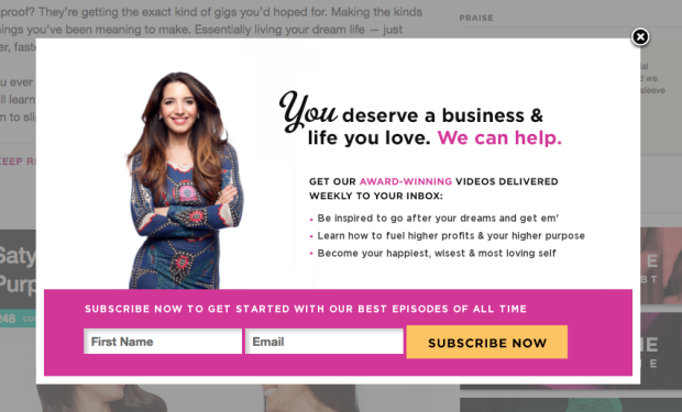
Do you see how the color pink was used to place emphasis on certain words? “We can help” and “award-winning” both pop right out at you, just before your eyes land squarely on the optin box at the bottom.
Because the “Subscribe Now” button is yellow (in contrast to the pink background), and it’s the only element of that color, it stands out even more than any other element on the popup.
38. Incite Curiosity
The information gap theory of curiosity is that we get curious when we think there’s a gap between what we know and what we don’t know. It’s like a mental itch that we just have to scratch.
If you want a surefire way of making your visitors stick around longer, use an information gap to incite curiosity. Once visitors get the curiosity itch, they’ll have to stick around to satisfy it.
In this popup, the headline promises to reveal the strategy that Gary Vaynerchuk used to get 832,241 YouTube views:
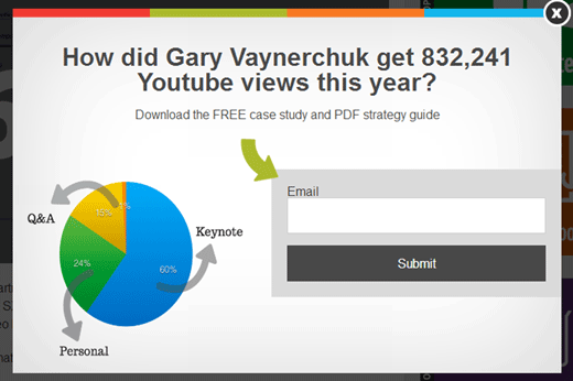
Because there is a perceived information gap, visitors will be driven to enter their email out of curiosity.
Derek Halpern offers five templates for crafting headlines that incite curiosity. These are perfect headlines for your exit popups:
- How’d you like to learn about [new remarkable thing] that [desirable outcome]?
- Ever wonder how you can earn [desirable outcome] with [new remarkable thing]?
- There’s a way for you to [desirable outcome] with this [new remarkable thing].
- If you heard about a [new remarkable thing] that could [desirable outcome], would you be interested in learning more about it?
- The key to a [desirable outcome] is to make sure you use [new remarkable thing].
39. Get Inside Your Visitor’s Head
By far the best way to get big results from your exit popups is by putting yourself in your visitor’s shoes, and offering them exactly what they need and want at that moment.
Ask yourself what are all the possible reasons for a visitor to leave this particular page on my website? Out of those, which are the most likely reasons?
CountryLiving knows that their visitors would love to have one of their mouth-watering meal ideas for dinner tonight. However, the main thing holding them back is time. Most people feel they simply don’t have the time to cook an elaborate meal. So, CountryLiving swoop in and save the day with “26 Easy Dinners that Can be Made in 30 Minutes or Less!”
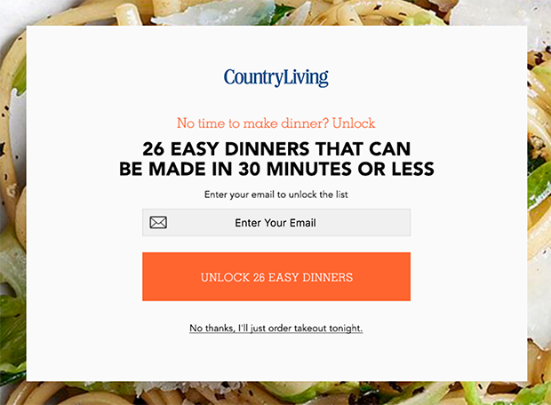
If you don’t want the easy dinners, well, you’ll just be ordering takeout then.
This is exit popups at their best. Get inside your visitor’s head, solve their reason for leaving, and become their hero.
40. Hide Popups from Existing Subscribers
If someone has already taken the action you wanted them to take, like subscribing to your email list, don’t show that exit popup to them again! Do, however, show a different popup, and a different offer, to those visitors.
There’s so much you can do with OptinMonster’s display rules engine, from follow up campaigns, to onsite retargeting, and more.
Maybe there is another action you’d like them to take to move them further along your sales funnel. Or maybe you want to take advantage of the fact that these visitors are warmer than the others, and ask for something bigger this time around. You could also offer a different lead magnet than you did before and build on that relationship by offering even more value.
We hope this article has given you tons of exit popup hacks you can use to boost your conversions. Take one of these and run with it, and don’t forget to see the email popup best practices to skyrocket your conversions, and then run a split test so you can measure your results.
Which was your favorite exit popup hack? Let us know in the comments!
