Are you looking for the best call to action examples that will inspire your customers to take action?
Ecommerce businesses often struggle to get their site visitors to take action without being too pushy. The good news is, it’s easier than it may seem.
In many cases, all it takes is a minor tweak to your call to action (CTA) to see conversions increase.
In today’s post, we will show you 20 perfect call to action examples. Our examples include both call to action buttons and worded call to action phrases.
- What Is a Call to Action?
- The Importance of a Good Call to Action
- How To Write a Call to Action That Converts
- 10 Perfect Button Call to Action Examples
- 10 Well-Worded Call to Action Examples
Let’s start with the call to action meaning, its importance, and how you can write one.
What Is a Call to Action?
Call to action definition: A Call to Action (CTA) is a prompt or instruction to encourage the target audience to take a specific action and typically involves getting your audience to click on a link.
The purpose of a CTA is to persuade the audience to take the desired action, which could be anything from purchasing a product or signing up for a service to downloading an eBook or filling out a survey. CTAs are typically designed to be attention-grabbing and prominently displayed to maximize effectiveness.
CTAs can be delivered through various mediums, including websites, social media posts, email marketing campaigns, and advertisements.
Common call to action example includes “Buy Now,” “Learn More,” “Subscribe Today,” “Download Your Free Trial,” “Register for Our Webinar,” “Join Our Mailing List,” and “Contact Us Today.”
These are all common types of CTAs that you’ve likely run into before and generally come in two types, both related to links.
You can have CTA as a button or a link with anchor text; the latter is more common in social media posts, blog posts, or other text-based content.
So what is a CTA? Again, it’s simply any direct command that encourages your audience to take action.
And the surprising truth about CTAs? They’re crucial for increasing your conversions and sales.
The Importance of a Good Call to Action
You may not believe it, but your call to action is essential for your bottom line. A well-worded call to action may be the difference between your business thriving and tanking.
And no, that’s not an exaggeration. Protocol 80 sourced the following statistics to show the value of CTAs:
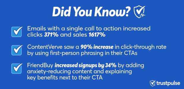
This small aspect of your marketing strategy can lead to some significant changes. That’s why you must be extra particular about presenting your call to action to your customer.
Otherwise, you risk leaving unnecessary conversions and profits on the table. So let’s check out some best practices and call to action examples for creating highly clickable CTAs.
How To Write a Call to Action That Converts
Creating the perfect call to action can be tricky. The goal is to ask your audience to do something without coming off too pushy, which can be a tricky line to walk.
Plus, your language to craft your call to action changes depending on your audience. That means there’s no “one-size-fits-all” solution to creating a solid call to action. However, some general guidelines are always true.
OptinMonster has written an extensive article on creating the perfect call to action. If you haven’t read that yet, you definitely should.
Here are a few of the most important tips in that article, along with a few new ideas to make your CTA extra clickable.
These include:
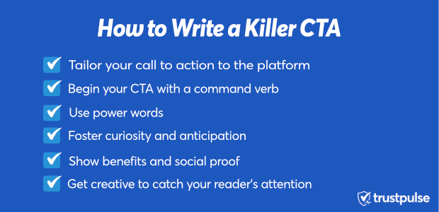
Let’s take a look at each point in more detail.
Tailor Your Call to Action to the Platform
Your call to action button changes depending on where you deliver it to your audience. On your website, you’re bound to have a call to action button encouraging people to use your product or service.
The button’s CTA is probably short, and something like “Get Started Today!”
However, you may write posts on social media with a longer, more in-depth call to action that asks users to click a subsequent link.
These may read something like, “Take advantage of our 15% off discount by clicking the link and start shopping today!”
The length and copy of your call to action must be appropriate for your platform. For example, CTA buttons are typically shorter (3-7 words), and text-based CTAs can be longer. But a good rule is to make them as concise as possible.
That said, we’ll see some call to action phrases later that you can use as templates for your blog or social media posts.
Begin Your CTA With a Strong Command Verb
Believe it or not, people like to be told what to do. However, it would be best to strive for conciseness and clarity when telling customers what to do. After all, humans have so much going on in their everyday lives that it’s better to have a straightforward, specific task to follow.
So your call to action isn’t the time to dance around what you want. Instead, be straightforward and begin your CTA with a command verb.
For example, which of these calls to action is more likely to get clicks:
- Signup now for your free eBook
- Why not join today?
While neither should be the golden standard for a CTA, the first is the clear winner. It shows you a benefit for taking action (which we’ll discuss later) and does all the thinking for you by starting with a command verb.
However, the second one poses a question and gets you thinking about why you can’t join today.
Remember, a good call to action takes as much thinking out of the equation as possible.
Use Power Words
Related to using a command verb to start, you should be using power words to enhance the copy of your CTA. Power words trigger a psychological or emotional response from the reader.
While readers understand a regular CTA, readers feel a great one. Power words get your audience feeling something that encourages them to take action.
So rather than “Take advantage of our offer to increase your sales today,” you may write, “Take advantage of our once-in-a-lifetime offer to skyrocket your sales now!”
Small additions of power words like “once-in-a-lifetime,” “skyrocket,” and “now” make the second option a much more clickable call to action. And if you need some help with power words, you’re in luck.
Need more wildly successful power words to revolutionize how you write your CTAs? Check out OptinMonster’s comprehensive list.
(☝️See what we did with the power words there?)
Foster Curiosity and Anticipation

One strategy for creating a killer call to action is to foster curiosity and anticipation.
Building curiosity would be like, “Learn how this former pizza delivery guy started a 7-figure online business at home.”
To effectively build curiosity, you reveal the result of whatever story you’re telling in your content without showing how you’ll get there. The goal is to connect your audience with something they want (the result) and get them curious about how to achieve it.
Anticipation is another strategy that works better for selling products. Again, you’re selling someone the result that your product brings and getting them excited for their new life change.
For example, an online fitness coach may make a call to action such as “Transform into your sexiest self today!”
This paints an image of the customer’s desired result and excites them about that dream becoming a reality. This anticipation drives them to take action.
Show Benefits and Use Social Proof
Another excellent method for spicing up your call to action is showing a tangible benefit or relying on social proof. Showing your audience a real benefit for your call to action usually (but not always) involves offering a discount or promotion.
These calls to action usually start with the command verb “save” or “redeem” and read something like “Save 25% by joining today!” or “Redeem your 2-for-1 coupon right now!”
Writing your CTA with a benefit adds an extra incentive (a value proposition) to the equation that boosts your conversion rate. But you also have another trick up your sleeve: Social proof.
The most common type of social proof for CTAs is leveraging fear of missing out (FOMO). Fear of missing out is a phenomenon that occurs in most consumers and is super powerful.
Many infomercials saw huge sales increases when their call to action changed from “Call now, operators are standing by“to “If lines are busy, please call again!”
When listeners heard the first CTA, they thought, “If operators are standing by, it must not be a popular product.” But when they heard the second CTA, the opposite occurred. They thought, “If lines are busy, this product must be top-rated. I should call.”
FOMO is an incredibly powerful tool that you can start using to craft stronger CTAs that lead to much higher click-through rates (CTRs).
If you want to start using social proof, we recommend trying TrustPulse.
TrustPulse specializes in positive action notification popups. You’ve likely seen these before, probably even while reading this article:

These small popups leverage social proof to increase conversions by up to 15%. Adding this type of social proof is an absolute no-brainer for such a small change to your site to have such a massive impact on your sales.
It helps you drive business and improves the user experience by adding credibility to your product.
And while we’d love for you to go with TrustPulse, we know other options exist.
That’s why we remind users never to use software that encourages or allows fake social proof.
If users learn that your positive action notifications are fabricated or fraudulent, you’ll have an uphill battle earning back their trust.
This a small disclaimer, but very important to keep in mind as you build your site or brand’s authenticity. This is crucial as you strive to maintain your company’s online reputation.
Boost your sales by up to 15% by joining TrustPulse today!
Get Creative to Catch Your Audience’s Attention
One of the hardest things to do in the digital world is to separate yourself from the noise. The only way to truly stand out is to get creative. The Harmon Brothers are incredible at this.
They’ve made such viral ads as the Squatty Potty, Poo Pourri, and Goldilocks & the Purple Mattress:

These ads did exceptionally well and got many viewers to take action.
Why? Because they stand out in a world of boring advertising. And you can do the same.
You don’t need to create mythical creatures or spend millions on video production. You need to get creative in connecting with your audience. Use language that stands out from the standard messaging and grabs the eye.
Plus, you can use various visual creation tools to make stunning images and videos without breaking the bank.
For example, the company Manpacks used a call to action that hit home with its audience:
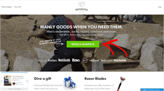
Build a manpack.
It’s strong, simple, and built curiosity in men who wondered, “What is a manpack, and why do I suddenly feel like I need one?”
If you’re confident in your marketing skills, try to break free from the mold and experiment with a creative copy.
Okay, now that we have some tips on writing a clickable call to action, let’s see how some of the best companies in the world do it. We’ll be splitting our call to action examples into two sections:
- Call to action buttons
- Text-based calls to actions
Let’s get started.
10 Perfect Button Call to Action Examples
On most websites, you’ll see calls to action in the form of a button. Again, the text is usually concise (3-7 words) and clearly expresses what the company wants the user to do.
Let’s see some call to action examples from the biggest businesses in the world and how they craft their own CTAs.
1. Netflix
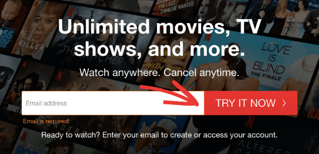
Netflix has a straightforward, clear call to action. Their easy-to-spot “Try it now” button stands apart from the rest of the page with its bold color scheme.
Plus, the copy implies that you can try the software before committing.
You don’t need to get too creative when your brand is as famous as Netflix. This simple call to action example is all it takes for hundreds of new subscribers each month.
2. HelloFresh
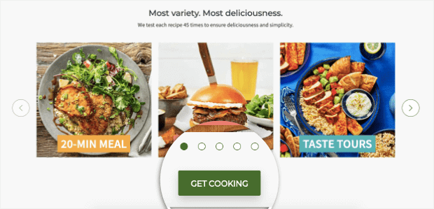
This is just one of HelloFresh’s call to action examples. The fun little “Get Cooking” button is authentic to their brand. Plus, it makes people imagine themselves already in the kitchen preparing tasty meals for the family.
3. Prezi

A lot is going in this call to action example: imagery, the testimonial by HuffPost, and the call to action. They don’t give too many details on the software, so the phrase “See how it works” is terrific at building curiosity and anticipation.
4. Nike

Nike has never been one to use two words when one will do. Their world-famous slogan, “Just do it,” is as straightforward as it gets. We shouldn’t expect anything else from their call to action.
The one word “Shop” is all they need to tell customers what to do. And if Nike is doing it, there must be something to the short-and-sweet approach.
5. Basecamp
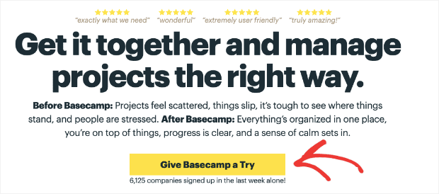
The creators over at Basecamp are known for keeping things casual and never overthinking a decision. Their call to action fits their laidback style and welcomes people to test the software.
6. Sendinblue
Sendinblue’s CTA is a refreshing change from the usual “Try Now.” The phrase “Take a free test drive” reminds users to try the software risk-free. This phrase also adds playful color to the animated image of the car on the righthand side.
7. Bluehost
Bluehost’s call to action example is a friendly reminder that people don’t want the ½ inch drill; they want the ½ inch hole. When most people think of site builders, they think of platforms like WordPress.
The last thing they want to think about? Finding the right host.
Bluehost plays on this emotion by avoiding phrases about site hosting and dives straight into site creation. After all, that’s what their visitors hope to accomplish from Bluehost.
8. LiveChat Inc
LiveChat Inc‘s CTA is short, to the point, and adds the value proposition. It stands out because of its bold red coloring (like we saw with Netflix) and reminds users to give the software a test spin free.
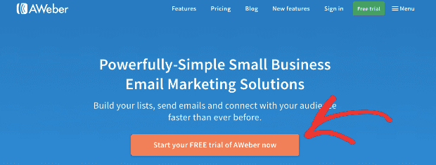
9. AWeber
AWeber flirts with the CTA word-length limit, but they manage to pull it off. Their bold orange button color directly draws the reader’s eye to the message. They add the ” free ” value proposition to entice users to click through.
10. Spotify

Here’s one last call to action example by one of the world’s most famous brands, Spotify. They use a green button on an orange background showing a well-placed contrast to draw your attention.
Like many other call to action examples, Spotify highlights that you can sign up and use their service at no cost or risk.
Let’s shift gears and look at longer, text-based forms call to action examples.
10 Well-Worded Call to Action Examples
The following call to action examples come from blogs or social media. They are longer phrases that encourage users to click a link and redirect their attention to another page.
11. OptinMonster

We couldn’t write this blog post on calls to action without referring to our parent company, OptinMonster. If you follow their blog (which you really should if you want to master lead generation tactics), you’ll notice they end their posts with a consistent call to action.
And this is standard practice for most blogs.
This small phrase asks people to share the post (if they enjoyed it) on various social media platforms. Examples like this are an important reminder that not all CTAs need to be sales-driven.
12. Neil Patel
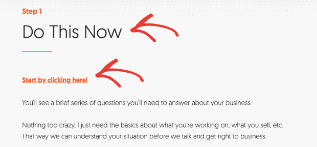
Neil Patel is one of the world’s most famous marketing “gurus.” At the end of one of his posts, you’ll see he adds a call to action for people to sign up for his small course. Though the second CTA (“Start by clicking here”) is where users take action, it’s his first step that draws you in.
The bold “Do ThisNow “message is impossible to ignore and gets readers to follow to the next step.
13. The Art of Manliness
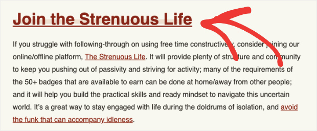
Though most people wouldn’t think the copy “Join the Strenuous Life” is catchy, it’s perfectly suited to their target audience. They are constantly writing about self-discipline, getting more “tough,” and putting yourself in difficult situations to grow as a person.
As such, this is the perfect call to action to tempt their user base.
14. Fitness Machine
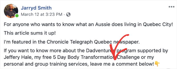
A subtle call to action from personal trainer Jarryd Smith, this Facebook post asks users to engage. For example, they want to participate in a 5-day body transformation challenge. In that case, they need to leave a comment as indicated.
This is one great way of getting free traffic from Facebook.
15. WordStream
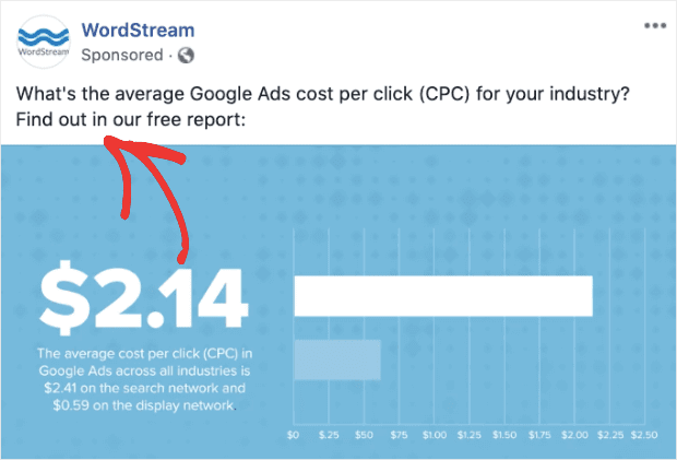
WordStream has some good calls to action across their site, but this one comes from a Facebook post. They do a great job of building your anticipation and curiosity by offering a free Google Ad cost report.
This is a super enticing offer for any marketers who run paid ads.
16. LinkedIn
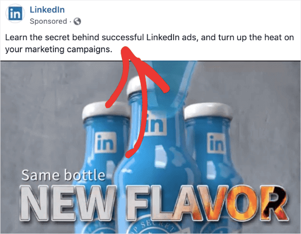
Besides the fantastic imagery below this post, notice how LinkedIn uses some power words to spice up its CTA. In this case, the two most effective words are “secret” and “successful.”
Everything about this call to action indicates something you don’t know hinders your success with LinkedIn ads. And if you click through, they’ll be happy to show you.
Talk about leveraging FOMO.
17. Promo
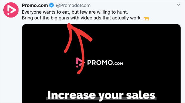
This post on Twitter is more fun than the standard call to action. They take an old saying, “Everyone wants to eat, but few are willing to hunt,” to set up their CTA:
“Bring out the big guns.”
This goes a long way in building anticipation.
18. Grammarly
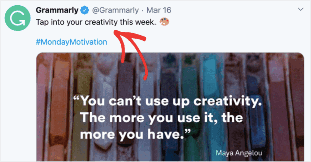
Grammarly does an excellent job with its calls to action. First, they have a killer service, so they never need to try too hard to attract customers. But they do well at getting writers excited to write.
Here, Grammarly encourages its users to “Tap into their creativity,” which is speaking their audience’s language.
19. Backlinko
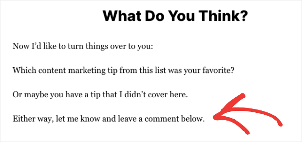
Returning to blogs, we have another call to action example from the famous digital marketer Brian Dean. On his site, Backlinko, he uses a subtle call to action to encourage users to engage with his post.
Here, he isn’t redirecting his readers anywhere else and wants them to focus on leaving a comment.
20. Amy Porterfield

Our last call to action example is from Amy Porterfield, a marketing coach with loads of courses, podcasts, blogs, and just about any other kind of content you can imagine.
As she finishes one blog post, she adds a well-written call to action, “Click here to change your life with B-School!” If powerful language like that doesn’t build curiosity and anticipation, we don’t know what will.
Putting it All Together
We’ve covered a whole lot of ground today. Before wrapping up, we wanted to remind you that a perfect call to action is only part of the equation. In other words, no call to action will ever work if it’s the only thing people see.
So, to have the whole package, you need to work on a few different aspects of your site:
- Your web design
- Your site’s overall copy
- Create alluring content
- and any other strategy to get users to sign up for your services
So as we finish this post, it’s time to put our money where our mouth is and give you a few calls to action of our own.
If you enjoyed this article, share it with your friends and colleagues on Facebook or Twitter. You can also let us know if you’ve seen or made an awesome example of a call to action.
Finally, are you 100% positive that you’re optimizing your site for the most sales possible? If you don’t have positive action notification software on your site, the answer is a firm “no.”
Ready to get started with the world’s best social proof software? Sign up for your risk-free TrustPulse account today!


Thanks for finally talking about > How to Write
a Killer Call to Action (With 20 Perfect Examples)
Christie]
You’re very welcome! We hope you enjoyed the post.
Thank you for this post, Deana. Picked up a few things from the 10-worded-CTAs section.