Have you ever wondered how to captivate your website visitors from the very first moment they land on your page?
Look no further than splash pages.
A splash page is a powerful tool in web design that serves as an engaging introduction to your website. It provides your users with a visually stunning and interactive experience right from the start.
But what a splash page really is? And how can you use it to increase engagement?
In this article, we’ll define splash pages and explain how they differ from landing pages and home pages. We’ll also share excellent splash page examples to inspire you to implement this strategy on your website. In the end, we’ll guide you on creating your own captivating splash page.
Let’s start!
- What Is a Splash Page?
- What Is the Difference Between a Splash Page and a Landing Page?
- What Is the Difference Between a Splash Page and a Home Page?
- 7 Great Splash Page Examples
- How to Create a Splash Page
What Is a Splash Page?
A splash page is a web page that serves as an introductory or welcome screen for a website or an application. It’s usually a visually appealing and attention-grabbing page that appears before the home page to share a specific message or prompt a certain action from visitors.
The purpose of these pages is to captivate the user’s attention, create a strong first impression, and enhance the user experience of your webpage.
Typically, a high-quality splash page has the following main elements:
- Clear and concise headline
- Eye-catching visuals
- Brief (but engaging) copy
- A clear call-to-action (CTA)
Splash pages often include eye-catching graphics, animations, or multimedia elements, such as videos. And you can use them in multiple ways to achieve specific goals.
Some of the common ways you can use splash pages include:
- Promoting a product or service
- Collecting contact information
- Displaying announcements or updates
- Asking for age verification
- Providing legal disclaimers or terms of service
- Offering language or regional selection
- Gathering feedback
- Conducting surveys
- And more!
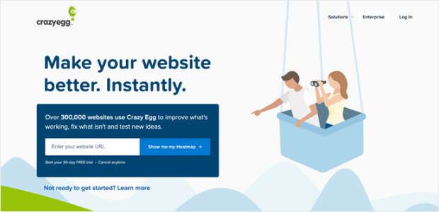
For example, CrazyEgg greets you with a splash page that offers a free heatmap. Once you enter your URL and create a profile, it takes you to their free trial setup to receive your free heatmap.
What Is the Difference Between a Splash Page and a Landing Page?
A splash page is a preliminary web page briefly displayed before users can access the main content or website. It’s often used for promotional or introductory purposes, aiming to capture visitors’ attention or convey a specific message.
Splash pages typically include minimal content, such as a logo, a captivating image or video, and a brief message or call to action. It also has fewer navigation options. For instance, it may have a simple “Enter” button or a link to skip the splash page and proceed directly to the main website.
For example, fashion and eCommerce retailer Zara uses a splash page to ask users for their language and location. From there, it directs them to a personalized version of their online store site.

A landing page, on the other hand, is a standalone page that a user is directed to after clicking on a link. Usually, that link can be from an advertisement or a search engine results page. It’s designed specifically to prompt visitors to take a particular action, such as:
- making a purchase,
- signing up for a newsletter, or
- filling out a form.
Landing pages are content-rich and contain persuasive copy, relevant information, and specific calls to action. They often have details about a product, service, or offer, along with testimonials and benefits. They may also include any other content that can convince visitors to take the desired action. The main focus of a landing page is driving conversions, and it’s commonly used in marketing campaigns.
Codecademy provides a simple yet effective landing page example.
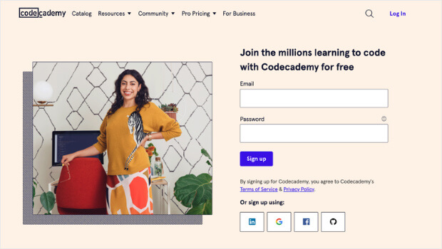
The page features a concise copy, clean graphic design, and a light color scheme. The form is straightforward, requiring only an email address and password. Moreover, users can also sign up using Google, GitHub, and other social media platforms, making the conversion process even easier.
Finally, the landing page stands out by prominently displaying real-life success stories and testimonials, which plays a crucial role in building social proof.
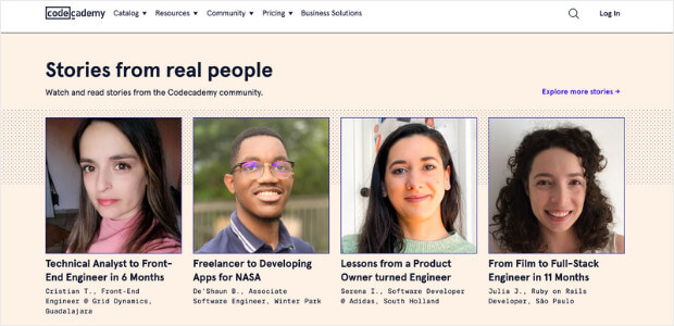
Social proof refers to the impact that the positive experiences of others can have on influencing potential customers’ decisions. When people see positive experiences with a product or service, it creates trust and increases their likelihood to engage or make a purchase.
Similarly, you can provide visitors with more information and reassurance by prominently displaying social proof on your splash page.
They can see how your product or service has positively impacted others, which can create a sense of trust in your brand. This, in turn, increases the likelihood of conversion and encourages visitors to take the next step, such as creating an account or making a purchase.
TrustPulse is the best social proof platform to build trust in visitors.
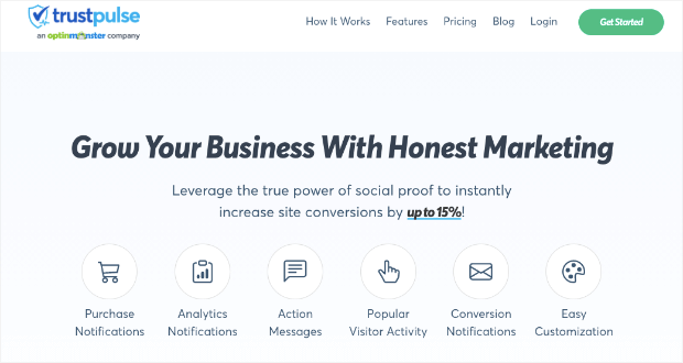
It’s a powerful tool that integrates seamlessly with a splash screen to display social proof effectively. With TrustPulse, you can showcase real-time notifications of recent customer activity on your splash page in the form of popups, such as:
- purchases,
- sign-ups,
- testimonials,
- reviews,
- and more!
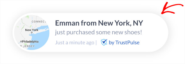
This social proof tool integrates easily with all website platforms like Shopify, WooCommerce, BigCommerce, and more. And it also comes with analytics to see the performance of your campaigns. This way, you can optimize your results and boost campaign conversions.
But the best part?
TrustPulse offers a free money-back 14 days trial, no questions asked. So sign up for your 100% risk-free TrustPulse account now!
Resources:
- How to Create a Landing Page in WordPress (the Easy Way)
- Easy Landing Page Design Tips to Boost Conversions
- Landing Page Ideas That Are Strikingly Simple (and Actually Work)
- How to Quickly Customize Headers in WordPress (Step by Step)
- Social Proof Statistics: Reasons Your Business Needs Social Proof
- Social Proof: Free Tips for Social Proof Marketing Inside
- Social Proof Examples To Start Using Today
What Is the Difference Between a Splash Page and a Home Page?
A splash page is a temporary introductory page that appears before the actual homepage. Its purpose is to convey a specific message or prompt an action from visitors.
A home page is the default first page of a website. It usually serves as the central starting point, gives visitors an overview of the website, and guides them to different pages via links and menus.
Here are a few more differences between splash pages and home pages in more detail:
- Content: A splash page typically contains minimal content and focuses on a specific message or call to action. A home page usually includes a broader range of information, such as featured content, sections, and links to different pages.
- Purpose: A splash page is often used to create anticipation, promote a product or upcoming event, or capture user attention. A home page is designed to provide immediate access to key information, services, or products.
- Design: A splash page generally has a simple design and may or may not feature a video or background image. A home page offers a more comprehensive design, combining visuals, navigation menus, and interactive elements.
- Links: A splash page often includes a prominent Enter or Exit link (or a button) to proceed to the main website/application. A home page usually features a consistent navigation menu to explore different sections or pages within the site.
Let’s look at an example from Airbnb to explain their difference further.
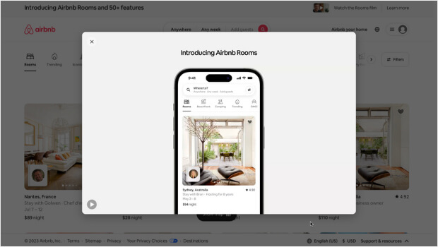
Airbnb’s splash page features two things:
- A clear headline: “Introducing New Airbnb Rooms.”
- A video showcasing the new rooms
The headline grabs the visitors’ attention by highlighting something new and exciting. It creates a sense of curiosity and encourages users to explore further.
The presence of a video on this splash page provides a visual and immersive experience. It allows potential guests to glimpse the new Airbnb rooms and create a desire to book a stay. Read Video Marketing Statistics You Must Know if you want to promote your products using a video marketing strategy.
And this is what Airbnb’s home page looks like:
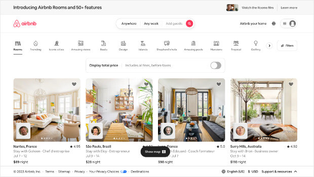
This home page features:
- A prominent search bar that allows users to quickly enter their destination, dates, and guest count.
- Tailored suggestions based on the user’s location, previous searches, and saved listings.
- Multiple images to showcase various rooms.
- Trust indicators like verified reviews and safety filters to reassure users about the reliability and security of Airbnb listings.
- Well-organized layout and intuitive navigation menus to make it easy for users to find the necessary information.
Explore Best Drag and Drop WordPress Page Builders (Compared).
7 Great Splash Page Examples
Now that you know everything about a successful splash page, let’s explore some of the best splash page examples from actual companies.
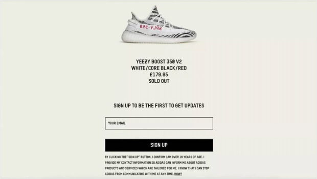
1. Yeezy (Adidas)
What This Splash Page Does Well:
- Preempts visitors’ disappointment by clearly stating upfront that the new limited edition model has sold out.
- Provides visitors with the chance to join the waiting list, generating email leads.
This approach not only manages expectations but also promotes excitement around the product. In addition, highlighting how rare and desirable they are makes the Yeezy sneakers even more appealing.
2. Coty
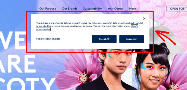
What This Splash Page Does Well:
- Prominently states that privacy is important, which shows the company’s commitment to protecting user data.
- The body text provides a concise and clear explanation of the company’s data collection and privacy approach.
- Offers users full control over the data the company collects about their visit to the site.
- The two CTA buttons, “Accept all” and “Reject all,” provide users with a straightforward choice regarding their cookie preferences.
- The “Set my cookie choice” link allows users to customize their cookie preferences beyond the two broad options of accepting or rejecting all cookies.
Read our article on Brand Authenticity: How to Build a Brand People Love (and Trust).
3. Cannadips
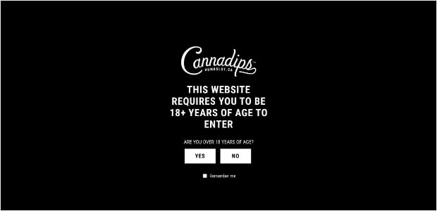
Cannadips’ splash page asks visitors to confirm if they are over 18. Addressing this requirement right at the beginning ensures compliance with regulations and helps the company to:
- Create a more personalized and relevant experience for the target audience
- Provide age-appropriate content
- Ensure a smoother browsing experience for users of legal age
- Uphold legal age restrictions
- Promote responsible usage of their products.
What This Splash Page Does Well:
- The straightforward and to-the-point copy clearly states the conditions of entering the website.
- The presence of Yes or No buttons enables visitors to access the website more quickly by providing them with a straightforward entry option.
If you’re looking for amazing GDPR plugins to ensure you’re not breaking regional laws, check out: Best GDPR Plugins to Help You Avoid Heavy Fines.
4. GAP
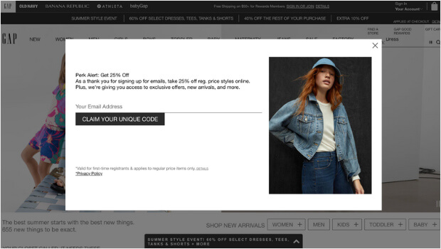
This splash page establishes a clear value proposition: visitors provide their email addresses for a 25% discount and access to exclusive content. This value exchange is a persuasive tactic that encourages visitors to become subscribers and helps the company to grow its email list.
What This Splash Page Does Well:
- A clear copy stating that visitors can expect a 25% discount after signing up for the company’s email list.
- Besides the discount code, the copy also highlights additional benefits to encourage more sign-ups.
- The extra visual support is excellent for giving visitors an idea of what they can buy with the 25% discount code.
5. Chase Center
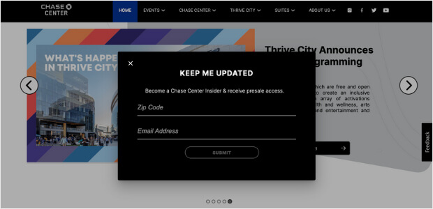
What This Splash Page Does Well:
- The headline “KEEP ME UPDATED” is clear, concise, and creates a sense of urgency.
- The body text effectively communicates the benefit of signing up. The “presale” lead magnet can be highly desirable for fans of events and performances held at the Chase Center.
- Clean and simple design, making it easy for visitors to navigate and understand.
- The fields for entering the zip code and email address are prominently displayed, ensuring a smooth user experience.
- Collecting the zip code allows Chase Center to provide personalized updates and offers based on the user’s location.
6. Conversion Gods
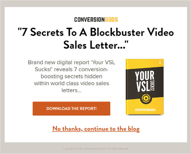
What This Splash Page Does Well:
- The headline “7 Secrets To A Blockbuster Video Sales Letter…” immediately captures visitors’ attention with its bold text. It creates curiosity and entices them to explore further.
- The use of power phrases like “conversion-boosting secrets” generates interest by suggesting that the report contains exclusive information.
- The simple design and no flashy animations allow the page to load quickly. This helps prevent visitors from abandoning the page due to long loading times.
7. Drake Waterfowl
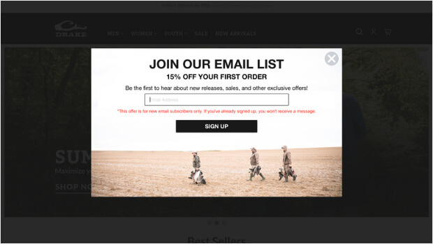
What This Splash Page Does Well:
- The fact that the sales letter is displayed in bold text draws attention to the key message.
- The message “15% OFF YOUR FIRST ORDER” is concise and to the point, making it easy for visitors to understand the value they’ll receive by signing up.
- The body text effectively conveys the added benefits of joining the email list. It appeals to customers’ desire to be the first to know and access special deals.
Don’t forget to check out Lead Generation Form Examples (That Convert Visitors Into Customers).
How to Create a Splash Page
A splash page is a powerful tool to capture visitors’ attention and effectively communicate your message. By incorporating engaging visuals, concise copy, and a clear call-to-action, you can create a splash page that leaves a lasting impact on your audience.
To simplify the process of creating stunning splash pages, try OptinMonster.
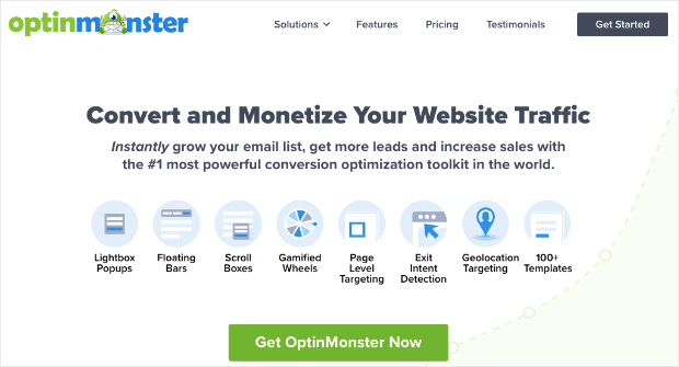
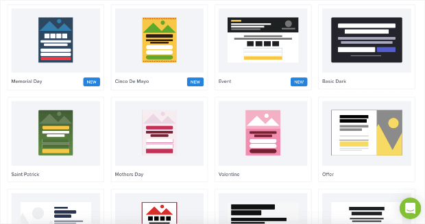
OptinMonster is a leading conversion rate optimization tool that offers a wide range of splash page templates and customization options designed explicitly for creating splash pages. Whether you want to:
- promote a new product,
- collect email addresses, or
- showcase a limited-time offer,
OptinMonster enables you to craft compelling splash pages to drive conversions and boost engagement.
From customizable templates to advanced targeting and analytics, OptinMonster equips you with the tools necessary to create highly effective splash pages tailored to your unique goals. And with its user-friendly interface and robust features, you can design eye-catching splash pages without any coding or design skills.
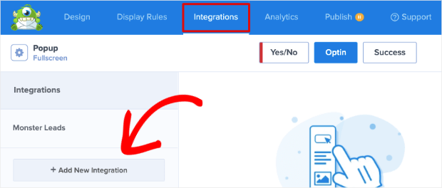
Furthermore, OptinMonster lets you integrate your splash page with various email marketing platforms or CRM systems. This allows you to capture and nurture leads seamlessly through your sales funnel.
So why wait? Start creating stunning splash pages with OptinMonster today!
