Wondering how to make your eCommerce website design stand out?
The best eCommerce sites are both attractive and functional. This can elevate the perceived value of your products and brand.
In this article, we’ll show you top-notch examples of eCommerce website design and why they work. No matter how big or small your online store is, you can learn from the best.
Let’s take a look!
What Makes the Best eCommerce Website Designs?
The best website design for eCommerce isn’t just about what looks the prettiest. It’s about what converts best. After all, eCommerce websites exist for a purpose: to make money!
Good eCommerce design is about 5 main things:
- Trust
- Navigation
- Mobile Optimization
- Cart and Checkout
- Branding
Let’s think about what each of these factors really means.
Trust
People are understandably afraid of getting scammed or cheated online. You can’t see who you’re doing business with in online shopping, and it’s easy for bad actors to hide behind a keyboard.
This means your eCommerce store needs to earn customer trust through transparency and security. A great eCommerce website can easily answer questions from potential customers like:
- How do customers contact you if they have questions or a problem with your products?
- What information do you collect and how do you keep that information safe?
- How can customers get a refund or exchange if they’re not satisfied?
- Is your website secure?
Listing your company’s contact information, FAQs, privacy and return policies, and website security measures can go a long way in easing customer concerns.
Social proof is another important way to build trust. Social proof like customer reviews, testimonials, and real-time purchase notifications show that other people are buying, using, and liking your products. This can help prospective buyers feel more confident about purchasing from your brand.
One of the easiest ways to add social proof to every page of your website is with TrustPulse.
TrustPulse is the best sales notification popup software for WordPress, Shopify, BigCommerce, and any other eCommerce platform you can think of. With just a few clicks, you can add subtle but persuasive notifications to your eCommerce website design.
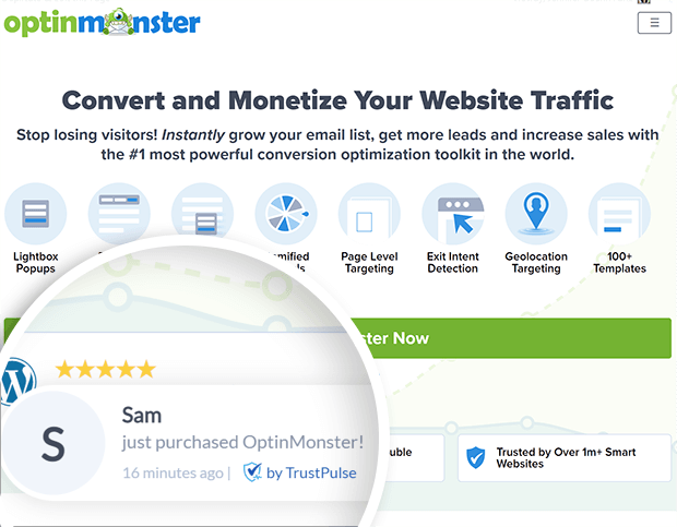
TrustPulse can display a real-time feed of sales, signups, downloads, and many other conversions on your site. This indicates to new visitors that they should buy or subscribe too. You don’t need any coding or design experience to add these notifications with TrustPulse.
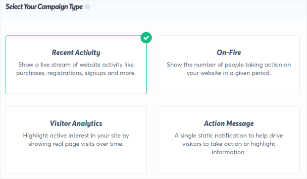
Want to try it out for yourself? Sign up for your 100% risk-free TrustPulse account to get started.
Navigation
The most beautiful design or expertly written product descriptions won’t do your eCommerce business any good if your customers can’t find the products or information that they’re looking for.
Thoughtful and user-friendly navigation improves both user experience and SEO (search engine optimization), so give the structure of your eCommerce site some careful consideration.
Your navigation menu needs to balance simplicity with clarity. You don’t want 25 different links across the top of your eCommerce site, but you also don’t want users to have to click through 8 levels of pages.
Ideally, customers should be able to reach every page on your site from the homepage with 3 or fewer clicks. Adding breadcrumbs can help visitors keep track of where they are and figure out where they need to go.
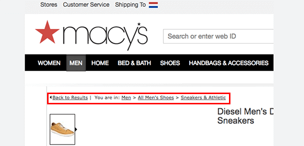
Another essential navigation element is a search bar. WooCommerce users can build powerful onsite search engines with SearchWP. You also want to make sure that your search results and category pages are easily filtered by size, color scheme, and other important attributes. That way visitors can sort out exactly what they want.
Remember: the sooner customers can find what they want, the sooner they can buy it!
Mobile Optimization
Many shoppers use mobile devices to browse, compare, and buy products. If your eCommerce website doesn’t have a responsive design, it’ll look terrible on mobile and may not function properly. This can erode customer trust, and turn off even those who were interested in buying from you.
To prevent this, choose a responsive template or theme from your eCommerce platform. Make sure that every design element resizes and realigns properly on different screen sizes. Use high-contrast, simple fonts for body copy so that your site remains readable.
Cart & Checkout
The ultimate goal of any eCommerce website design is to drive sales. This means that you need to prioritize the shopping cart experience above all else.
No matter how creative your site design may be, don’t hide the shopping cart. Place the cart icon in the upper-right corner, as this is where customers are used to looking for the cart. Make sure the shopping cart is reachable from every single page on your site. Whenever possible, show the number of items in the cart so customers don’t forget what they’ve added.

Other ways to optimize checkout design include enabling one-page checkout and guest checkout whenever possible. Trim down your checkout forms so that you’re only asking for personal information that you absolutely need.
For example, many online shoppers don’t like to give out their phone numbers. If you aren’t going to use that contact information to deliver their order, don’t demand that information.
You can also add a progress bar to your checkout page to show customers that they’re almost done. Checkout is where many visitors start to doubt their decisions, so remove as much friction from the process as possible.
Branding
Finally, branding is a critical part of your eCommerce website design. Your brand is not just your logo, but also the imagery, copy, brand name, brand voice and tone, domain name, and much more.
While we don’t have time to get into a full course on brand development, we want to point out 2 basic principles.
First, your brand needs to be consistent to be recognizable. This means that you use similar and complementary design features not just throughout your website but on your packaging and marketing materials.
Second, your brand should appeal to your target audience, not just feature the colors or fonts that you personally like. A good brand designer can help you develop a strong brand identity.
If you want to build a successful eCommerce brand that customers love, read How to Build an Unforgettable and Profitable eCommerce Brand.
Now that you understand the basics of eCommerce website design, we’ll look at some real-world examples!
15 Stunning eCommerce Web Designs
We’ve sorted our list of eCommerce website designs into different industries, but you can easily take design inspiration from websites outside your specific niche. Let’s take a look!
1. Bliss
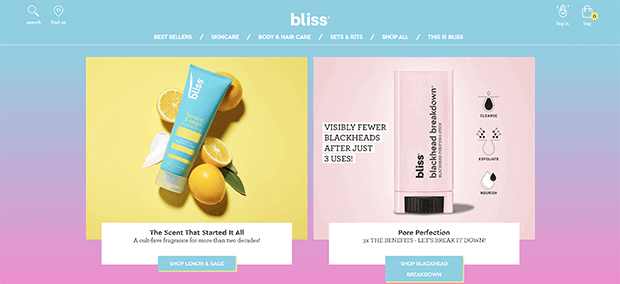
Skin care brand Bliss lives up to its name with gentle, shaded colors that promote a feeling of relaxation. The navigation bar has 6 easy-to-understand links, a search box, and shopping bag, all in the customary locations so users don’t have to guess. The site uses a mix of lifestyle product photos and stylized illustrations. The product images are all color coordinated to create a cohesive look.
2. GXVE Beauty
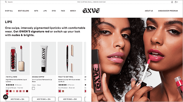
Gwen Stefani’s beauty brand GXVE Beauty uses high-quality photos to show off the products in use. The homepage is divided into sections for each facial feature and the corresponding products. The navigation menu also uses facial feature as the main category
3. Then I Met You
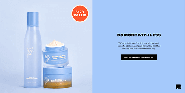
The website for Korean beauty brand Then I Met You features their signature periwinkle blue as well as a high-contrast orange. The site design lets their high-quality product speak for itself, with minimal design elements to match a minimalist product recommendation.
4. Aerie
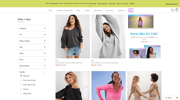
Fashion brand Aerie leans into the retro trend with bright colors and a 2000s-era browser window motif. On their product category landing pages, you can sort by fit, size, color, and even sleeve length. Once customers find their perfect new outfit, the search bar and shopping bag are easily found in the upper right corner, right under the floating bar promoting current deals.
5. Dopegood
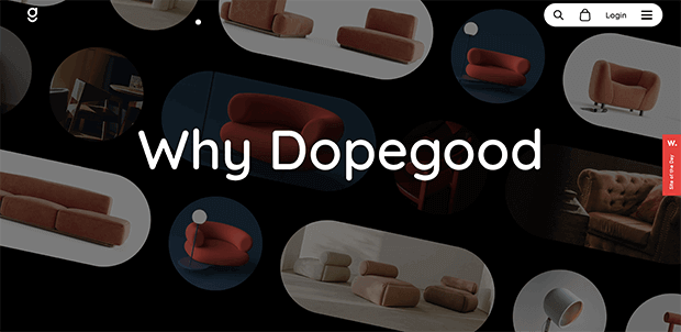
Dopegood uses rounded edges on their high-quality images to echo the chunky round shapes on their products. The high contrast black and white spaces on the site lets the product photos take center stage. There’s tons of important product information, like detailed measurements and styled photos, to help buyers picture the furniture in their space.
6. Coop Home Goods
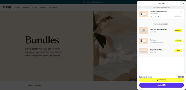
Coop takes shopping cart accessibility to the next level by using a slide-out cart. This lets shoppers see their cart, and the upsells, without leaving the page.
Check out the Difference Between Upselling and Cross-Selling.
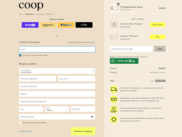
Their checkout process is a single page, but still manages to fit essential information like shipping and return policies and satisfaction guarantee.
7. Jenni Kayne
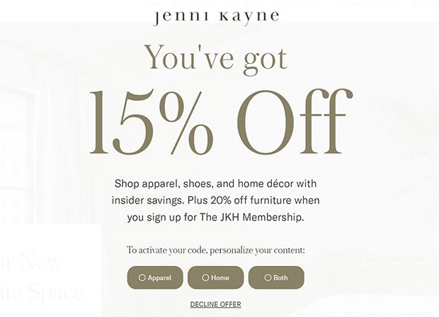
Jenni Kayne does a great job of keeping navigation simple despite having a large catalog. They have a link for best sellers across the whole site, and then intuitive product category links. We especially like their fullscreen welcome mat that offers personalized coupon codes based on the type of product you’re looking for.
8. Signature Hardware
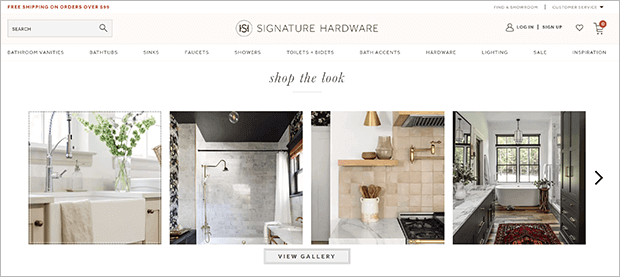
The brand Signature Hardware knows that their customers want more than just a working faucet. That’s why they’ve created a shoppable style guide with links to the relevant product pages. They also include a large resources section with design inspiration and home upgrade tutorials.
9. Crossrope
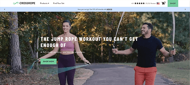
To show off their specialty fitness product, Crossrope features a large video slideshow at the top of their online storefront. The top navigation bar features social proof in the form of 20,000+ positive reviews, the all-important cart icon, and a bold call to action (CTA) button in case you missed it elsewhere.
10. Juiced Bikes
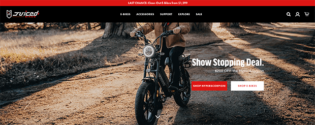
You know exactly what Juiced Bikes sells as soon as you open the page, which is important for more niche products. The bold colors and striking product photos grab the viewer’s attention. And the special promotions in the floating bar and the first section of the homepage are impossible to miss.
11. Nudl Journals
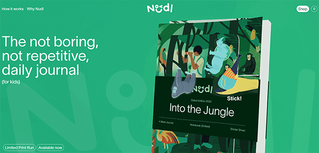
Nudl sells kids journals, and their site has tons of kid-friendly design elements. From the whimsical logo, to the interactive product photo, this eCommerce website design easily invites playfulness. With a small product line, the brand keeps navigation simple with a single Shop button.
12. Moon On My Wall
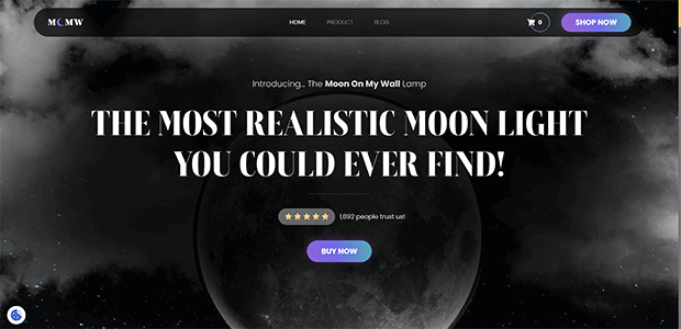
Moon On My Wall uses dreamy shades of gray with golden accents to reflect the glow of their moon-shaped lamp. Moving elements catch the eye and encourage further scrolling, past a number of conveniently placed CTAs. The number of items in the cart updates automatically and is highlighted by a colorful circle.
13. KiwiCo
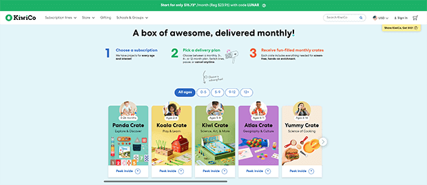
Another children’s company called Kiwi Crate makes it easy for busy parents to sort through their many products based on age and interest. The navigation menu features photos of the corresponding age group. We especially like their use of social proof in the form of user-generated content posted to social media and real customer reviews.
14. Omsom
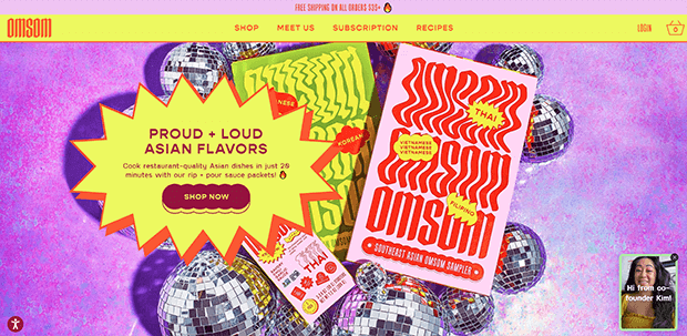
Asian food brand Omsom uses “proud, loud” colors and typography to reflect the proud, loud flavors in their sauces. Instead of videos, the site uses simple animated GIFs. Because they’re only a few frames, these GIFs load faster than videos, and also show how easy the product is to use.
15. Basic Kneads
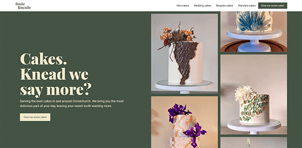
Even a local small business can use the principles of good eCommerce website design to create a website with high conversion rates. The scrolling photos and punny headline catch the visitor’s attention, while simple navigation lets new customers find the kind of cake they need.
16. Engine Station

Engine Station is a masterpiece of custom branding. Even the cookies notification box uses the brand’s bright colors and fonts. This is a great example of a no-scroll homepage, even on mobile. The floating top and bottom bars frame the content nicely and draw the viewer further into the website.
17. Doc Popcorn
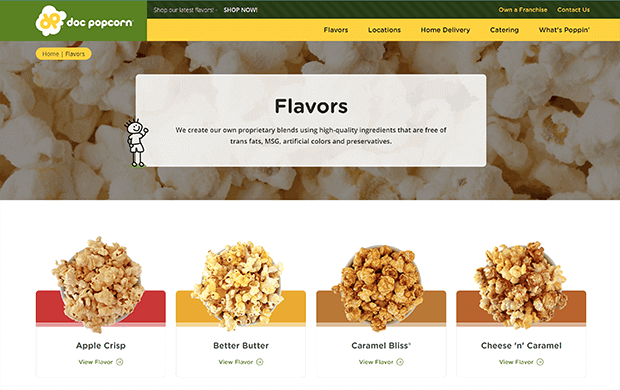
While Doc Popcorn’s website has to serve a wide variety of users, from individual consumers to franchisees, they build clear pathways for each user throughout the site. The navigation menu is sorted by use case, whether that’s retail locations, home delivery, or catering. The Flavors category page guides users toward the information they need next with a CTA for home delivery. Each individual flavor page has links at the bottom to other popular flavors. All of this keeps users onsite longer, which boosts the chances that they’ll pull out their credit card and place an order.
18. Daily Harvest
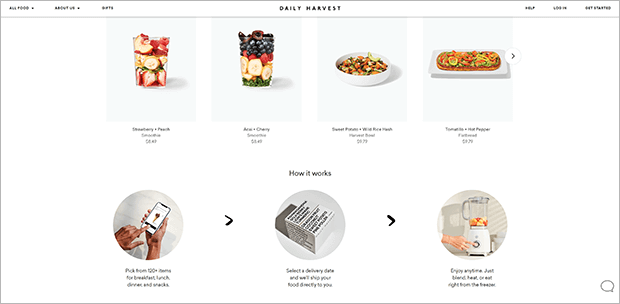
Healthy food startup Daily Harvest uses a simple white background and black font to let the colorful fruits and veggies in their products stand out best. Simple GIFs and lifestyle photos demonstrate how easy it is to place an order.
Next Steps: Create Your Own Perfect eCommerce Website Design
Hopefully this list has given you some inspiration for your own eCommerce website. If you’re ready to level up your eCommerce site design, check out these resources:
- Best WordPress eCommerce Plugins
- How to Make a Small Business Website in 6 Easy Steps
- Best eCommerce Website Builders
- Complete eCommerce Launch Checklist
If you’d like to get started with social proof on your eCommerce site, give TrustPulse a try risk-free today!
