Here’s a textbook lesson straight from Social Psychology 101:
Relationships can’t survive and will certainly never thrive without trust.
That fundamental fact is true in your friendships, your family ties, and yes, even with your clients. But the problem is that you have a lot more work to do when building trust with clients than anyone else.
That means you really need to find out how to get customers to trust your website.
Because when it comes to dealing with a new company, most online consumers visit a website with caution:

Which means the responsibility to move visitors past that feeling falls to you. But what makes a website trustworthy, anyway?
In today’s post, we’re going to tackle that question head-on. We’ll cover 9 easy tips on how to get customers to trust your website.
After all, your website is likely the first impression you’re going to make on your customers. And if you want to start off on the right foot, then you need to begin using these tips today.
But first, let’s look at the value of earning your clients’ trust.
Why Building Trust Is so Important for Your Business
When someone visits your website for the first time, you only have a matter of seconds to make a lasting impression on them. So the way you portray your company through your site matters.
A lot.
TechJury sourced the following statistics on the subject:
-
48% of people cited a website’s design as the number one factor in deciding the credibility of a business.
-
94% of people say bad design is the main reason they don’t trust certain websites
-
Your website has 10 or fewer seconds to leave an impression on users
When customers don’t trust your site, you can expect a hard time getting people to work there way through your checkout flow. And if we’re honest, that’s probably the #1 reason for learning how to get customers to trust your website.
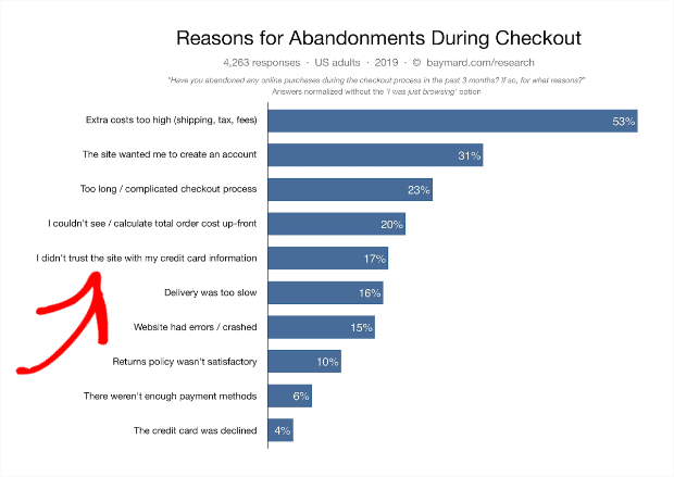
One of the most famous studies by the Baymard Institute shows that a customer not trusting a website is one of the largest reasons for increased shopping cart abandonment:
It’s no secret that building trust is crucial for the success of your business. But it’s a process that takes time.
In fact, the Nielsen Norman Group created the Trust Pyramid based on Maslow’s hierarchy of needs. The pyramid looks like this:
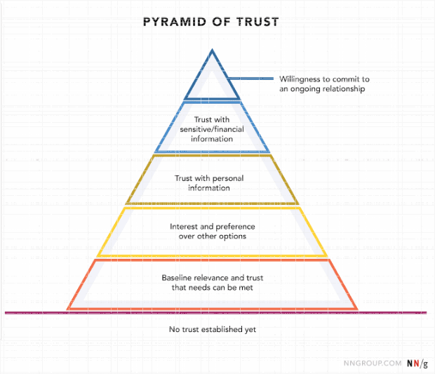
All too often, companies will try to skip some steps and jump from “No trust established yet” to asking for credit card information.
Fortunately, if you follow the 9 tips on how to get customers to trust your website, you can persuade even the most skeptical online shopper to trust you!
9 Tips on How to Get Customers to Trust Your Website
1. Design Your Homepage
When your visitors reach your site for the first time, there’s no telling which page they’ll land on. Perhaps they found one of your pay per click ads and reached a landing page. Or, maybe they just liked one of your posts on Facebook.
But if you effectively catch their interest, your clients are eventually going to find their way to your site’s homepage. That’s why it’s important that you design your homepage in a way that looks clean, professional, and, of course, trustworthy.
Check out the difference between a homepage designed like this:

And a homepage designed like this:

Which one would you be more likely to trust?
Even though you’re probably more familiar with the second example (Suzanne Collins is the writer of the famous Hunger Games series), you’d likely choose the first.
That’s because the first example by Amy Porterfield is more organized, has a large cover image, and has an easy to navigate header bar. It also has well-written web copy that looks, reads, and feels professional.
In other words, everything about Amy’s homepage shows that she makes an effort to keep the site up to date and polished. There’s obvious intention and care behind the homepage’s design, which makes people instantly trust her products and services.
Suzanne Collins’ site, however, has an outdated color scheme, no cover image, and text that doesn’t actually make much sense. The welcome text on the left promises a photo of the author with a rat in Central Park. But the main image is of her upcoming book (for the rat, you need to scroll down).
When designing your site’s homepage, follow the classic web design principles to keep things uncluttered. Introduce yourself or your brand, and include some of the other social proof signals that we’ll cover in the following tips!
2. Update Your Overall Web Design
Beyond just your homepage, you also need to decide a few key components about your overall site design. If you want to inspire trust among your users, you need to design your entire site in a modern style.
That means making sure you:
- Create a stylish color palette for your site
- Use the same font (or fonts) consistently
- Give each page a specific purpose
- Avoid clutter
- Check for typos or grammar errors
- Include a header menu that isn’t cluttered and is easy to navigate
These web design tips can be the difference between a site that looks like this:

And one that, unfortunately, looks like this:

And no, that one isn’t a bad joke. It’s an actual website that exists right now.
If you aren’t great with web design, no worries. We have a starter guide with some basic principles here. Otherwise, you may want to consider hiring a professional designer to get your site looking pristine.
Because when it comes to how to get customers to trust your website, web design can be the “make it” or “break it” factor.
If you want to create a website for your business, check out:
3. Test Everything
Just because your site looks pretty doesn’t mean it’s ready to inspire trust. You also need to make sure it’s fully functional.
Once you think your site is complete, go back and test everything including:
- Links in the header or footer
- Contact forms for questions
- Social media icons
- Payment gateways
- Subscription forms
- Automated e-mail sequences
- And any other action your visitors can take on your site
The last thing is especially important to test before you make any kind of sales pitch. You never want to publicly promote your site with the intent to sell a product and get a public message like this:

It’s hard enough to get users to take action on your website as it is. Trying to get them back after your website was acting buggy? That’s near impossible.
Even if it’s a totally trustworthy website in the first place.
So go back, test, and experience your site through your users’ eyes. Making your site 100% functional may not add a whole lot of trust (because it’s expected in today’s digital age), but having a broken site is a surefire way to lose your customers’ trust.
4. Include Trust Badges
When people visit your site for the first time, they don’t know whether you’re a real business or just another online scammer.
Make sure your customers feel secure while using your site. You can do this by displaying the appropriate trust badges.
We recently wrote a comprehensive article on 12 types of trust badges you can use on your site. This includes small icons showing what makes you stand out such as free shipping, a money-back guarantee, free trial periods, and so on.
If you have read that post, you should definitely check it out. But for our purposes here, let’s look at the top 2 trust badges you need to have:
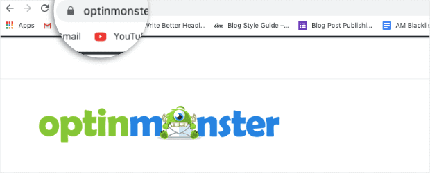
SSL security lock icon next to your URL: You’ve probably seen this little icon a million times, even if you’ve never noticed it. It’s a small, grey lock (if your browser is Chrome) that lets users know your site is secure and SSL certified. It looks like this:
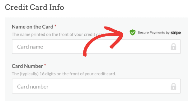
Secure payment icon: If you’re accepting money via your website, you need to add a secure payment trust badge. These let your customers know that their payment information is secure. The icon could be as simple as something like this:
Though you can put many other trust badges on your website, the two listed above are the bare minimum. With these, your site’s visitors will know your site and their financial information is protected.
This is definitely one of the biggest tips on how to get customers to trust your website.
5. Gather Testimonials
When it comes to creating, discovering, or innovating, people love to be first.
But when it comes to experimenting, testing, and using, people prefer to let others play the guinea pig. Testimonials are a great way of showing visitors that your business has been used and is approved by others.
In fact, testimonials are one of the strongest forms of social proof you can leverage. BigCommerce found that when visitors see testimonials on your site:
- 58% are more likely to convert
- Your website generates 62% more revenue per visitor
- People spend 3% more (on average) per order
Fortunately, getting testimonials from your customers is super easy.
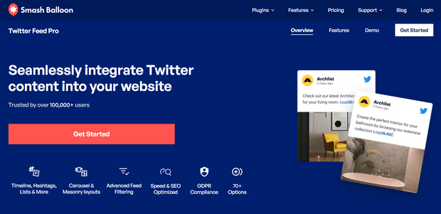
Plus, you can also automatically display testimonials from social media on your site with a plugin like Smash Balloon.
For example, with Smash Balloon’s Custom Twitter Feeds Pro, you can display a feed of tweets that mention your account or a feed of tweets that include your branded hashtag.
Here’s what it looks like:

These types of testimonials also inspire a healthy dose of fear of missing out (FOMO) for your other visitors. This makes a lot of visitors feel really enticed to engage with your calls to action.
And as you know, that can lead to huge boosts in your conversions rates and overall revenue.
6. Show Current or Past Clients Who Are Well-Known
Much like testimonials, showing your current or past clients can be another great form of social proof to show that you (and your site) are reputable.
The goal is to add clients who are well-known to most people so you can borrow some of their credibility.
Awesome Motive goes a step beyond. Not only do they list their featured clients, but they also include a list of publications where their articles have been published:

This borrows credibility not just from their world-renown clients, but also from widely read publications. This is an excellent strategy on how to make your website more trustworthy.
7. Build Your Presence on Social Media
Though this doesn’t technically fall under the umbrella of “building your site” in a way that inspires trust, your social media presence is definitely a factor here. That’s because your site’s online reputation extends far beyond your company’s URL.
The way that you interact with other people online says a lot about your brand’s personality. And as a business owner, you have a responsibility to engage with your customers.
How are you responding to online reviews, especially the negative ones? Are you getting back to your customers’ comments or questions? Do you regularly provide value from your social media posts?
These are the kinds of questions your clients won’t explicitly ask out loud. But they’ll definitely take notice if it looks like you have no online presence outside of your site. Make sure you clearly display the icons for the social media platforms you are active on.
Here’s an example from OptinMonster’s homepage near the bottom footer:
![]()
These small icons don’t just give your visitors another way of contacting you. They also provide a little more assurance that your company is reputable, active, and engaged with your target audience.
So if you’ve ever wondered how do you build credibility online, displaying your social media icons is certainly a factor.
8. Include Contact Information in the Header Menu
One of the worst feelings from a potential customer’s perspective? Having a question or a problem and having no clue how to get in touch with you with your customer service department.
You should have your contact information readily available from every page on your site. This is related to displaying social media icons (as discussed in the last tip), but your contact information needs to be even more available and upfront.
The best solution is to add your contact information in your site’s main navigational header menu:
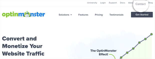
Why is this important? Because customers want to know that communication isn’t just a 1-way street.
Even if a customer never has any reason to get a hold of you, simply knowing that they can is a large factor in earning their trust. In other words, proudly displaying your contact information is an awesome solution for how to earn trust with customers online!
9. Use Positive Action Notification Popups
This is one last bit of social proof that you can use to tackle the age-old question:
How do you establish trust in an online business?
Positive action notification popups let other users know when someone has subscribed to or made a purchase on your site.
They look something like this:

But don’t let this small notification fool you. At TrustPulse, we’ve shown that these positive action notification popups can increase sales and revenue by 15%!
There’s a lot of software like TrustPulse that will let you add this function to your site. But here’s a quick word of warning, though:
Don’t choose companies that encourage or allow fake social proof signals.
Unfortunately, positive action notification popups can’t always be trusted. That’s because some companies encourage the use of fake social proof. The problem is that when people learn you’re using a company that allows fake social proof, they’ll assume yours is fake, too (even if it’s not!).
That’s why we’re proud of the fact that TrustPulse doesn’t offer anything other than genuine positive action notification popups. We allow users to broadly display this form of social proof across their entire website to enhance their users’ experience.
And since we’ve built our reputation on white hat marketing strategies, your site’s visitors won’t need to question whether or not these notifications are authentic.
So regardless of which software you choose to display these types of notifications, just be sure that they don’t allow fake social proof.
We hope that you learned a thing or two (or 9) from this article! Do you have any tips for building a website your users can trust that we missed?
If so, you can let us know in the comments below. Or follow us on Facebook and Twitter and let us know there!
And would you like to boost your site’s sales by 15%? All it takes is one simple change… so don’t wait! Join the TrustPulse community today.
We hope you found this article helpful. If so, you may want to check out the following posts:

I only had time to just skim over your pages but from what I have seen already, I would like to know more. You make sense when you discuss lack of trust as a big issue for people viewing websites. It is reassuring to know that there are ways to contact the authors.
I am a registered psychologist in Calgary, Canada. I always deal with distrust especially during the beginning of the first session.
I am about to create my website and hope to be able to offer people low cost ways to be able to solve many problems.