Are you struggling to capture leads and grow your email list?
A squeeze page can be the perfect answer to your problem.
Squeeze pages have proven to be highly effective in turning visitors into leads. This success is attributed to two crucial elements: offering a compelling incentive and eliminating distractions.
But what exactly is a squeeze page, and how can it benefit your business?
In this article, we’ll explain what a squeeze page is, how it works, and provide examples of high-converting squeeze pages. We’ll also share some valuable insights and actionable tips to help you create your own high-converting squeeze pages.
- What Is a Squeeze Page?
- Difference Between a Squeeze Page and a Landing Page
- Best Squeeze Page Practices
- 6 High-Converting Squeeze Page Examples
- Start Building High-Converting Squeeze Pages Today and Drive More Conversions
What Is a Squeeze Page?
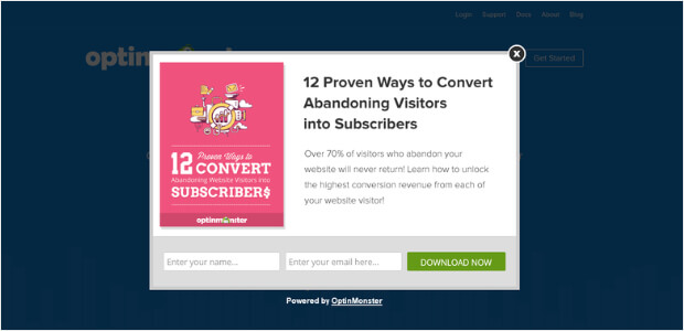
A squeeze page (also known as a lead capture page or opt-in page) is a type of landing page designed to collect contact information from visitors, typically their email addresses. Their primary purpose is to convert website visitors into leads and build an email list, usually in exchange for something of value, such as:
- free eBook,
- newsletter subscription,
- video tutorial, or
- access to exclusive content, and more.
The design and content of squeeze pages are focused on persuading visitors to provide their contact information willingly. And they are often standalone pages with minimal distractions and a clear call to action.
A squeeze page usually contains:
- A concise and compelling headline
- A brief description of the offer or incentive
- A prominent opt-in form where visitors can enter their email addresses or other relevant information
Visitors are required to fill out a form with their name and email address to receive the promised content or access. Once a visitor submits their information on a squeeze page, they become a lead. The website owner can then follow up with them through email or other forms of communication to build a relationship and convert them into potential customers.
Note: It’s important to clarify the benefits of sharing the contact information with your visitors. By doing so, you can ensure that your offer is perceived as valuable rather than appearing spammy or intrusive.
Check out Conversion Rate Optimization Tools To Capture Leads.
Difference Between a Squeeze Page and a Landing Page
Both squeeze pages and landing pages serve different purposes in digital marketing. However, understanding their distinctions can help businesses effectively tailor their strategies to achieve specific goals.
Let us explain their difference using an example.
Imagine you’re in the middle of a bustling city and come across two different stores. One has a massive billboard outside with flashy signs, enticing you to come in and explore their wide range of products. The other store, however, has a small yet intriguing entrance that promises a special offer if you step inside. These two stores represent the difference between a squeeze page and a landing page.
- A landing page is like the first store with an eye-catching billboard. It’s a standalone web page designed to grab your attention and persuade you to take a specific action, such as making a purchase or signing up for a service. Landing pages are typically used as part of marketing campaigns and provide detailed information about a product or offer.
For instance, let’s say you’re browsing the internet and stumble upon a landing page for a fitness program. The page may have vibrant images of fit individuals, captivating headlines, and persuasive descriptions of the program’s benefits. It might also include testimonials from satisfied customers, compelling videos, and a call-to-action button encouraging you to sign up for a free trial or purchase the program.
- On the other hand, a squeeze page is like the second store with an intriguing entrance. It’s a simple, focused web page that aims to collect information from visitors, usually their email addresses. Squeeze pages have minimal distractions and are designed to “squeeze” information out of the visitor, hence the email address.
For instance, suppose you come across a squeeze page offering a free eBook on healthy recipes. The page would typically have a captivating headline, a brief description of the eBook’s content, and a clear call-to-action button asking for your email address in exchange for the free resource. There might also be a mention of additional benefits you’ll receive by signing up, such as regular newsletters or exclusive discounts.
Read Awesome Newsletter Ideas That Will Keep Subscribers Engaged.
But what’s the main difference between both these pages?
To sum up, here are a few key differences between a landing page and a squeeze page:
|
Squeeze Pages |
Landing Pages |
| Captures visitor contact information only (mostly email addresses) | Requires more detailed information from visitors (such as name, email, phone number, or additional demographics) |
| Simple and concise with minimal distractions | Can be comprehensive and persuasive |
| Focuses on maximizing subscriber conversion rate (lead generation) | Converts visitors to customers |
| Displayed at the start of the buyer’s journey | Can be displayed at any point |
| Often used in email or advertising campaigns | Used with various traffic sources |
Don’t forget to explore the following articles about landing pages:
- Best Landing Page Builders for WordPress to Increase Sales
- What is a Splash Page (+ 7 Excellent Splash Page Examples)
- Easy Design Tips to Boost Landing Page Conversions
- How to Create a High-Converting Landing Page in WordPress (the Easy Way)
- Easy Landing Page Design Tips to Boost Conversions
- Landing Page Examples That Are Strikingly Simple (and Actually Work)
Best Squeeze Page Practices
As squeeze pages are crucial for marketers to gather leads and convert them into customers, designing an effective one can be challenging.
In this section, we’ll explore the best practices for creating a successful squeeze page that attracts visitors and converts them into leads.
Whether you’re a beginner or an experienced marketer, these tips will help you create a high-converting squeeze page to boost your business’s growth.
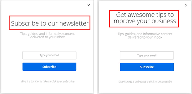
1. Clear and Compelling Headline

When it comes to creating an effective squeeze page, there is one element that can make or break your conversion rates: the headline.
A clear and compelling headline is the key to capturing your visitors’ attention and enticing them to take action.
First and foremost, a clear headline communicates the value proposition of your offer right from the start.
Visitors landing on your squeeze page are often busy and have short attention spans. They need to immediately understand what they gain by subscribing or providing their contact information. Your headline should convey a clear benefit or solution that captures their interest and compels them to learn more.
Moreover, a compelling headline triggers an emotional response that resonates with your target audience.
Emotion plays a significant role in decision-making. And by tapping into your visitors’ desires, fears, or aspirations, you can create an immediate connection. Whether highlighting a problem they’re facing or promising a transformational outcome, your headline should evoke emotions that make your offer irresistible.
Here are a few things you can keep in mind while creating a headline for your squeeze page:
- Be Concise and Specific: Keep your headline concise and to the point. Use powerful and action-oriented words to convey the specific benefits or results your offer provides. Avoid jargon or complicated language that might confuse your audience.
- Address Your Audience’s Pain Points: Identify your target audience’s main pain points or challenges and address them directly in your headline. Show that you understand their struggles and have a solution that can help them overcome those issues.
- Use Numbers and Statistics: Including numbers and statistics in your headline can add credibility and make it more compelling. Whether it’s a percentage increase, a time frame, or a specific outcome, quantifiable data can capture attention and make your offer more tangible.
- Create a Sense of Urgency: Incorporating words that convey urgency can create a fear of missing out (FOMO) and prompt immediate action. Phrases like “limited time offer” or “exclusive access” can motivate visitors to take action without delay.
If you want to learn more about FOMO, read:
- FOMO Marketing Strategy You Need To Start Using in 2023
- Best Popup FOMO Examples to Boost Your Conversions
- FOMO Statistics: Understanding the Fear of Missing Out
2. Minimalistic Design
One of the best practices to keep in mind while creating squeeze pages is minimalism. A minimalistic design approach emphasizes clarity and a focus on the essential elements of your page. By minimizing distractions and clutter, you can create a clean, visually appealing, and effective squeeze page that converts visitors into leads.
Most importantly, a simple design can help your squeeze page load faster. Slow loading times can significantly impact your visitor’s user experience and lead to high bounce rates. You can streamline your page’s loading time and improve its overall performance by reducing the number of images, graphics, and other non-essential elements. To learn more about page loading, read What Is Average Time on Page and How to Increase It.
Additionally, a minimalistic design can also help your visitors focus on the most critical elements of your squeeze page:
- the headline,
- the call-to-action,
- and the opt-in form.
When you reduce visual noise, you can guide your visitors’ attention to the elements that matter most, increasing their chances of taking the desired action.
To create a minimalistic design for your squeeze page, consider the following practices:
- Use a Clean and Simple Layout: Keep your layout clean and straightforward, with plenty of empty real estate and a clear hierarchy of elements. Use a grid system to align your content and maintain consistency throughout your page.
- Choose a Limited Color Palette: Use a limited color palette that complements your brand and creates a cohesive visual identity. Stick to a maximum of three to four colors to avoid overwhelming your visitors.
- Use High-Quality Images: Use high-quality images relevant to your offer and add visual interest without distracting from your content. Avoid using too many images or large file sizes that can slow down your page’s loading time.
- Prioritize Typography: Legible typography enhances your message and conveys your brand’s personality. Use less than three font families and choose sizes and styles that create hierarchy and contrast. Don’t forget to use bullet points where needed.
- Optimize for Mobile Devices: A growing number of visitors access websites on mobile devices. That’s why ensuring your squeeze page is optimized for smaller screens is crucial. Use responsive design techniques that adjust your page’s layout and content to fit different screen sizes.
Check out Web Design Principles that Will Boost Your Conversion Rate.
3. Focus on the Benefits
Make sure to create a squeeze page that effortlessly conveys the value proposition of your product or service. Instead of bombarding visitors with technical details or features, emphasize the direct benefits they will experience.
For example, let’s say you’re promoting a financial planning tool. Instead of stating that the tool offers “expense tracking” and “budgeting” features, emphasize the benefits. You could highlight that the tool will help them “gain control over their finances, save money effortlessly, and achieve financial freedom.”
By doing so, visitors quickly understand the value they stand to gain, which increases the likelihood of conversion. Also, when the benefits are front and center, the call-to-action becomes even more compelling, prompting visitors to eagerly sign up or take the desired action.
If you want to write a persuasive copy, explore:
- Tips for Writing Email Marketing Copy that Converts
- Expert Tips for Writing Landing Page Copy That Converts
- High-Quality Copywriting Templates Proven to Work
- Impressive Content Marketing Examples You Can Use
4. Utilize Social Proof
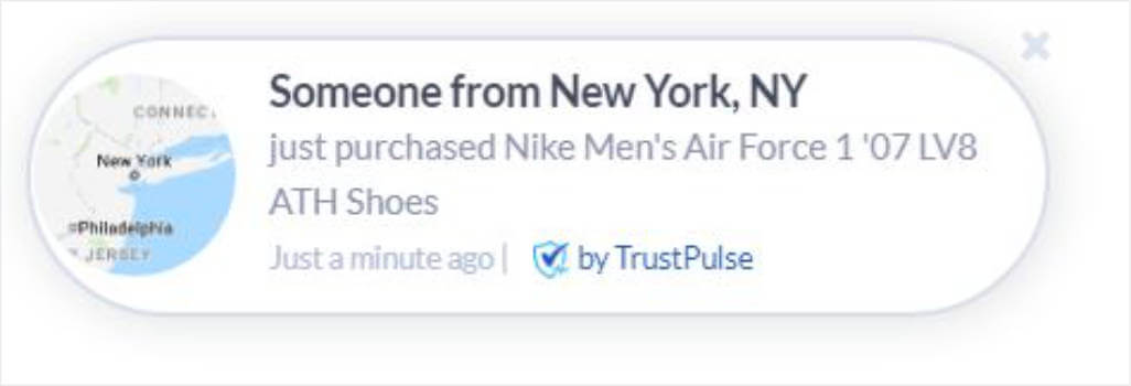
Imagine this: You land on a squeeze page that highlights five-star reviews from satisfied customers and displays real-time notifications of recent sign-ups. It also features numerous people who have already benefited from the product or service.
This social proof creates a powerful impression, assuring you that this offering is valued and trustworthy. It builds confidence in your mind and motivates you to take action, whether it’s signing up for a newsletter, downloading a free resource, or making a purchase.
That’s why you must show positive feedback, testimonials, and user statistics on your squeeze page. It can help you increase trust and credibility among your visitors and, ultimately, conversions.
To make the most of social proof on your squeeze page, try TrustPulse.
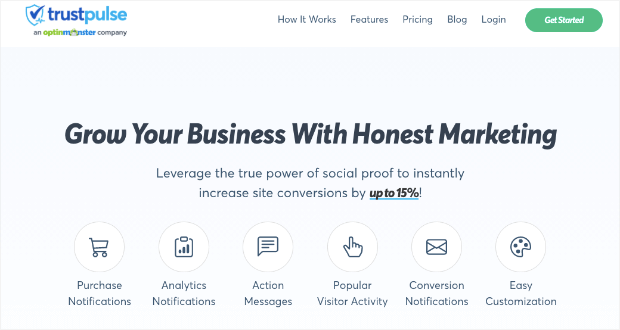
TrustPulse is the most powerful social proof tool that enables you to display real-time customer activity and engagement notifications. These notifications can include information such as:
- Recent sign-ups
- Purchases
- Downloads
- … and more!
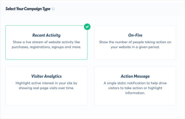
You can customize the notifications to match your site and brand perfectly. And it comes with four different campaign types that you can use in many ways:
- Recent Activity: Show recent website activity like purchases, downloads, sign-ups, and more.
- On-Fire: Show the number of people taking action on your website in a given period.
- Visitor Analytics: Highlight active interest in your site by a live visitor count to your pages.
- Action Message: Display a static notification to highlight information or help visitors take action.
Also, getting started with TrustPulse requires no coding skills or prior experience. The setup process can be completed in just three minutes, and you can boost conversions by as much as 15%.
Plus, TrustPulse seamlessly integrates with all the major website and email marketing platforms, including WordPress, Shopify, WooCommerce, Mailchimp, OptinMonster, and hundreds more.
And the best part? TrustPulse offers an unconditional 14-day money-back guarantee, no questions asked. So sign up for your 100% risk-free TrustPulse account now!
If you’re interested in learning more, here are a few more articles related to social proof:
- Social Proof: Free Tips for Social Proof Marketing Inside
- Social Proof Statistics: Reasons Your Business Needs Social Proof
- Best Social Proof Tools To Boost Your Conversions
- Social Proof Examples To Start Using Today
5. Use A/B Testing
After putting everything in place, how do you know if your squeeze page is working as well as it could be? That’s where A/B testing comes in.
A/B testing or split testing is a powerful technique that allows you to compare two versions of a web page to see which one performs better.
To conduct an A/B test on your squeeze page, you’ll need to create two identical versions except for one variable, such as the headline or the call-to-action button. Half of your visitors will see version A, and the other half will see version B. By tracking which version of the page results in more conversions, you can determine which version is more effective.
One of the best things about A/B testing is that it allows you to make data-driven decisions about your website. Instead of relying on guesswork to improve your squeeze page, you can use real-world data to make changes that are more likely to result in better performance.
For example, suppose your A/B test shows that changing the color of your call-to-action button from green to red results in more conversions. In that case, you can confidently make that change, knowing that it’s backed up by data.
To learn more about A/B testing, check out the following articles:
- Delightfully Simple A/B Testing Best Practices You Can Use Now!
- A/B Testing Examples to Get You More Conversions
- What Is a Split Test? How to Create It? (and Why You Should)
- Dumb A/B Testing Mistakes That Are Wasting Your Time
6 High-Converting Squeeze Page Examples
Here are some examples of squeeze pages you can explore for inspiration:
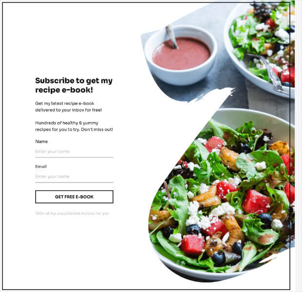
1. Free eBook Squeeze Page
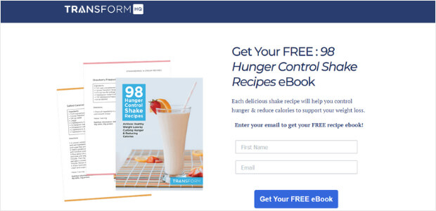
Why It Works:
- It offers a valuable resource that addresses a specific need: controlling hunger and reducing calories for weight loss.
- The headline immediately grabs the attention by emphasizing the “free” pricing of the ebook.
- The copy highlights the benefits of the recipes, emphasizing their deliciousness and ability to support weight loss goals.
- Finally, the call-to-action (CTA) button uses persuasive language and clearly indicates that the eBook is free.
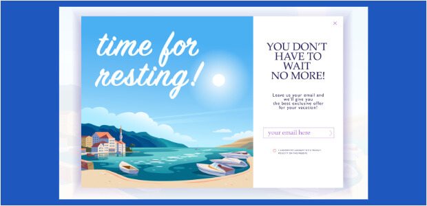
2. Webinar Registration Squeeze Page
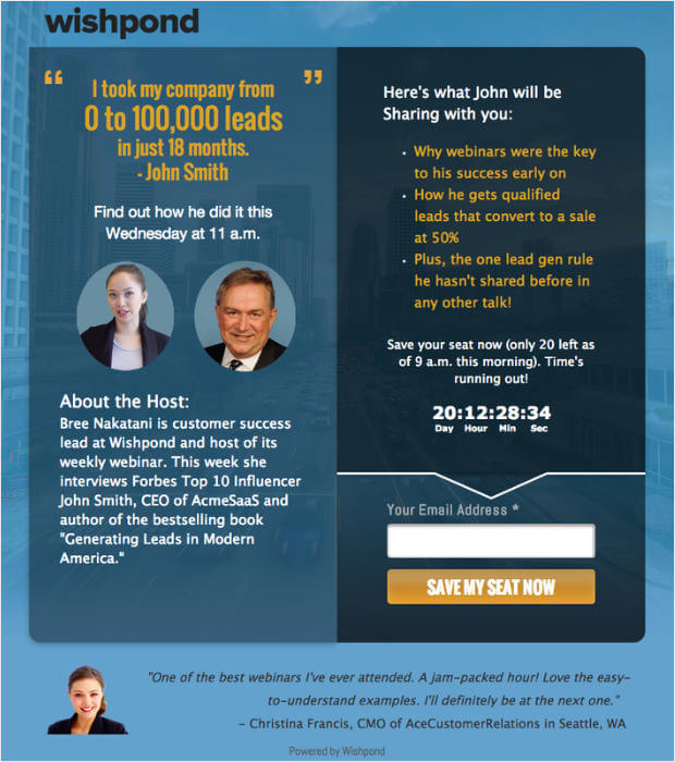
Why It Works:
- This squeeze page leverages the credibility and success of John Smith, who claims to have taken his company from 0 to 100,000 leads in just 18 months. This establishes trust and creates a sense of curiosity among the target audience.
- The copy is concise and highlights the key benefits of attending the webinar.
- The host, Bree Nakatani, is introduced, adding further credibility to the event.
- Including a countdown timer creates urgency and scarcity, encouraging visitors to take immediate action.
- The call-to-action (CTA) button, labeled “Save My Seat Now,” is clear and reinforces the urgency of securing a spot.
- Finally, the simplicity of the squeeze page, with only one field for visitors to enter their email addresses, reduces friction and increases the likelihood of conversions.
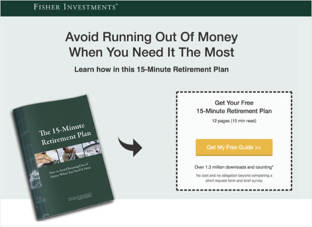
3. Exclusive Content Access Squeeze Page
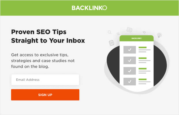
Why It Works:
- The headline grabs the attention by promising proven SEO tips straight to the visitor’s inbox. This immediately appeals to people who want to improve their site’s search rankings and traffic.
- The copy highlights the exclusivity of the content, emphasizing – the tips, strategies, and case studies that aren’t available on the blog. It creates a sense of value and uniqueness.
- The call-to-action (CTA) button, labeled “Sign Up,” is straightforward and encourages visitors to take action.
- The simplicity of the squeeze page, with just one field for visitors to enter their email addresses, makes it easy for them to sign up.
4. Video Squeeze Page
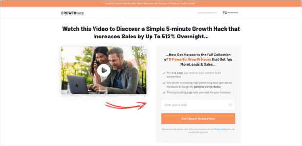
Why It Works:
- The headline creates intrigue by promising a simple 5-minute growth hack that can increase sales by up to 512% overnight. The strategic use of numbers in the headline captures the visitor’s attention and piques their curiosity.
- The copy then entices visitors further by offering access to a full collection of 17 powerful growth hacks that can generate more leads and sales. The specific benefits of the growth hacks are also highlighted.
- The call-to-action (CTA) button, labeled “Get Instant Access Now,” uses persuasive language and urges visitors to take action.
- Including an engaging video enhances the page’s effectiveness by providing visual and auditory information to reinforce the value of the growth hacks.
5. Contest or Giveaway Entry Squeeze Page
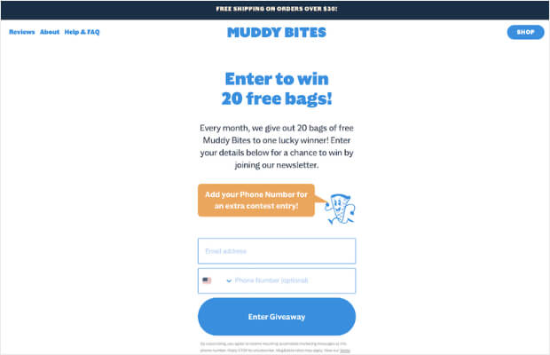
Why It Works:
- It offers an attractive incentive, 20 free bags of Muddy Bites, encouraging visitors to take action and enter the giveaway.
- The headline immediately grabs the attention by emphasizing the chance to win the free bags. It can help improve the click-through rates.
- The copy emphasizes the value of the giveaway and encourages visitors to enter by joining the newsletter. By joining the newsletter, visitors will likely receive ongoing company updates and promotions, helping build long-term relationships.
- The addition of an extra contest entry for adding a phone number increases the likelihood of visitors providing their contact information, which can be used for future marketing efforts.
- The call-to-action (CTA) button, labeled “Enter Giveaway,” is clear and directly communicates the action visitors need to take.
6. Black Friday Squeeze Page
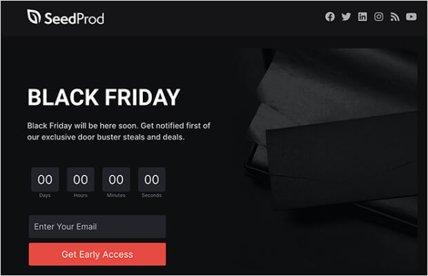
Why It Works:
- The headline immediately grabs attention by mentioning Black Friday, a highly anticipated eCommerce shopping event known for its exclusive deals and discounts.
- The copy creates a sense of urgency and exclusivity by promising visitors early access to deals. This taps into the excitement and desire to get the best offers before anyone else.
- Call-to-action (CTA) button, labeled “Get Early Access,” encourages visitors to sign up to receive notifications and ensures they won’t miss out on the limited-time deals.
- The inclusion of a countdown adds an element of urgency, reinforcing the need for visitors to take immediate action.
- With just one field for visitors to enter their email, the squeeze page keeps the process simple and reduces friction, increasing the likelihood of conversions.
Resources:
- 25 Proven Black Friday Marketing Ideas to Grow Your Business
- 13+ Black Friday Email Examples and Templates
- Ultimate Guide to Black Friday & Cyber Monday Marketing
- 9 Black Friday Marketing Tools to Skyrocket Your Sales
Start Building High-Converting Squeeze Pages Today and Drive More Conversions
And that’s it!
A well-crafted squeeze page can make all the difference in capturing visitors’ information and turning them into loyal customers. By implementing persuasive copy, a compelling offer, and an eye-catching design, you can create a squeeze page that converts at a high rate.
In order to build a high-converting and attention-grabbing squeeze page, many businesses turn to tools like OptinMonster.
OptinMonster is a popular conversion optimization software that simplifies the process of creating effective squeeze pages. With its user-friendly interface and powerful features, you can build visually appealing and engaging squeeze pages without any coding skills.
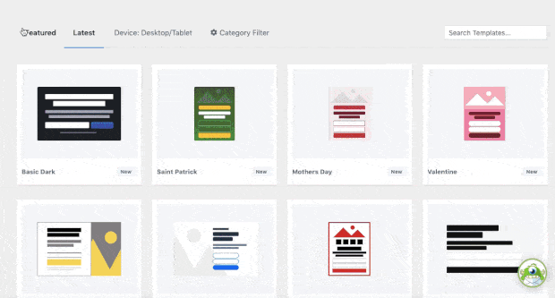
Don’t want to create everything from scratch? No worries. OptinMonster offers a wide range of pre-designed, customizable squeeze page templates to suit specific branding requirements. These templates are optimized for high conversions, ensuring that you can make the most of your squeeze page efforts.
And with its drag-and-drop builder, you can easily add and rearrange elements on your squeeze page, such as:
- headlines,
- images,
- forms,
- form fields, and
- CTA buttons.
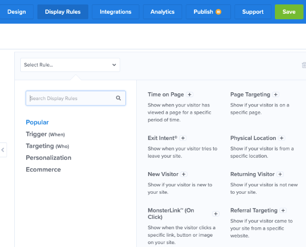
It also offers advanced targeting and segmentation features, enabling you to display your squeeze pages to the right audience at the right time. Through its behavior-based triggers, exit-intent technology, and personalized targeting, you can maximize the impact of squeeze pages by delivering them to visitors when they are most likely to convert.
Another valuable feature of OptinMonster is the A/B testing functionality. By regularly testing and refining your squeeze pages, you can optimize your lead generation efforts and improve overall marketing performance.
Plus, with its integration with popular email marketing platforms, you can automate your lead-nurturing process and drive more sales.
Ready to supercharge your squeeze pages? Get started with OptinMonster today!
